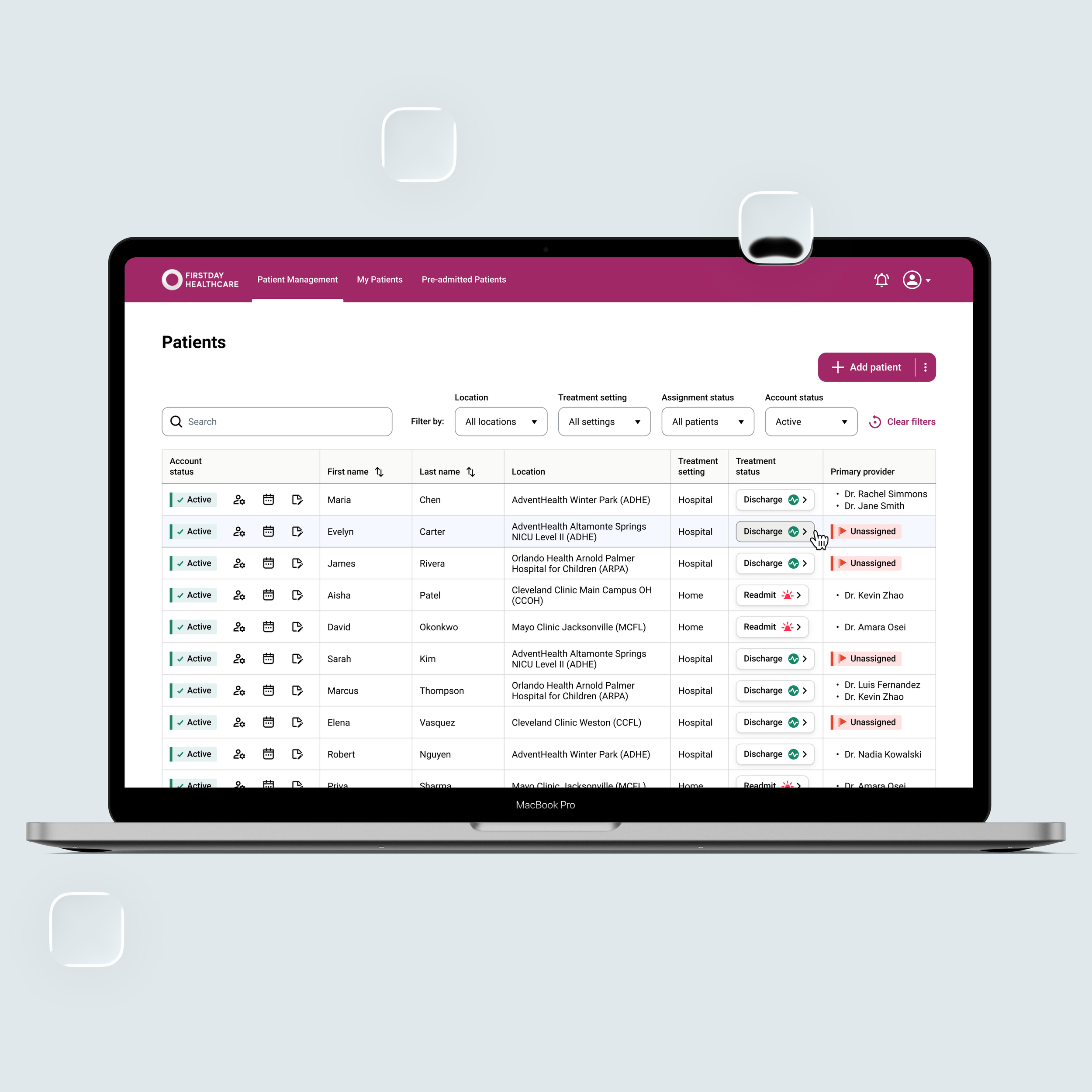
Firstday Healthcare: NICU-level care for preterm babies · 1
Overview
Industry: Healthcare · Digital Health
The scope: Rework the dashboard’s information architecture, data visualization, and layout to make complex clinical data easier to read, compare, and interpret across roles and viewing conditions.
Role: Product Designer (B2B SaaS, role-based workflows across provider, admin & customer teams)
Team: 12 engineers · 1 designer · direct stakeholder and investor collaboration
Type: Real client work, shipped
The context
⇢ Firstday Healthcare delivers NICU-level care for preterm babies: continuous vital-sign monitoring, plus 24/7 access to neonatal providers.
⇢ The software behind it is a multi-tenant SaaS platform serving three audiences in one system: the neonatal providers delivering care, admins managing care delivery, and Customer Account Owners who purchase and oversee the service for their organization.
I. What's being designed
Firstday Healthcare web app serves eight roles. Five of them see this dashboard, with overlapping but not identical data. What differs is which sections they can see and which metrics appear inside them.
The layout being designed is a universal page structure that has to hold for every role. If it survives at full complexity, the reduced versions are guaranteed.
That requirement has two audiences, and both audiences want the same thing: a page whose structure does not change with who is looking at it.
➢ 1. Users share pages with each other. Colleagues in different roles sit in the same meeting, look at the same screen, and talk about it. The moment a shared section moves or is laid out differently per role, screenshots, training material, and support calls all fragment.
➢ 2. Developers build one page, not five. The layout is a single template. Role logic should be able to remove a block a role is not permitted to see, and do nothing else. If role logic has to rearrange, resize, or re-flow, the team is maintaining five dashboards.
The Customer Account Owner is the role used throughout this case study, for two reasons.
⇢ The first is practical: it is the role with access to everything. Designing the fullest version first means every other role is a subtraction from it rather than a separate design.
⇢ The second is commercial. The account owner holds the subscription decision, and this page is where that decision gets informed: whether the caseload is staffed, whether babies are coming back, whether the programs work. It is a working tool and the product's case for itself.
II. Who reads this, and under what conditions
Accessibility here is not a compliance pass applied after the visuals. It is a constraint that determines what the visuals can be, so it is stated before them.
Design for the ward at 3 a.m. on a ten-year-old monitor, and the boardroom takes care of itself.
Start with who is reading, and under what conditions.
➣ The users are hospital staff. Many are on night shifts, when fatigue measurably degrades contrast sensitivity and color discrimination. They read the page fast, between other tasks. This is a glance, not a study.
➣ They read it on institutional hardware: standard-issue 1080px panels, uncalibrated, narrow gamut, mounted under ceiling lighting nobody chose, viewed off-axis by someone standing rather than sitting. A color that separates cleanly on a designer's calibrated display can collapse on a ward monitor at an angle, under glare, at 3 a.m.
➣ Roughly one in twelve men has some form of colour vision deficiency. Across a clinical team, at least one person perceives colors differently than they were designed.
➣ And the page does not stay on the screen. Dashboards get screenshotted, pasted into emails, and printed in grayscale, often photocopied afterwards.
So the page has to survive its worst rendering conditions, not its best. That is not a stretch goal, it’s the normal case.
The accessibility baseline
That is the floor. Everything below is built on top of it.
The following is only a fraction of the decisions documented throughout the project, highlighting how those principles shaped the design.
➣ 1. Nothing is encoded by colour alone. Every component state is differentiated visually as well as by colour. Statuses carry an icon, a word, and a color. Interactive states use additional changes in form, treatment, or position. Color is the fastest channel, never the only one.
➣ 2. Touch targets meet 44px, via invisible hit areas. The visual density the design system asks for is preserved; the interaction layer underneath is generous. A tired hand does not need to be precise.
➣ 3. Headings are a real hierarchy. The legacy product used all-caps labels with no structural markup. Research has shown that all-caps text slows scanning by removing the distinctive word-shape cues that make skimming possible. A proper heading hierarchy. Sentence case.
➣ 4. Contrast ratios hold at all times. Text meets 7:1, placeholder text 4.5:1, and interface elements 3:1.
➣ 5. People are counted as whole numbers; dates are unambiguous. The legacy product displayed 0.33 patients and dates like 03.06.2025, requiring users to interpret the format. The redesign uses whole numbers for people and abbreviated month names (e.g., 6 Mar 2025) to remove ambiguity.
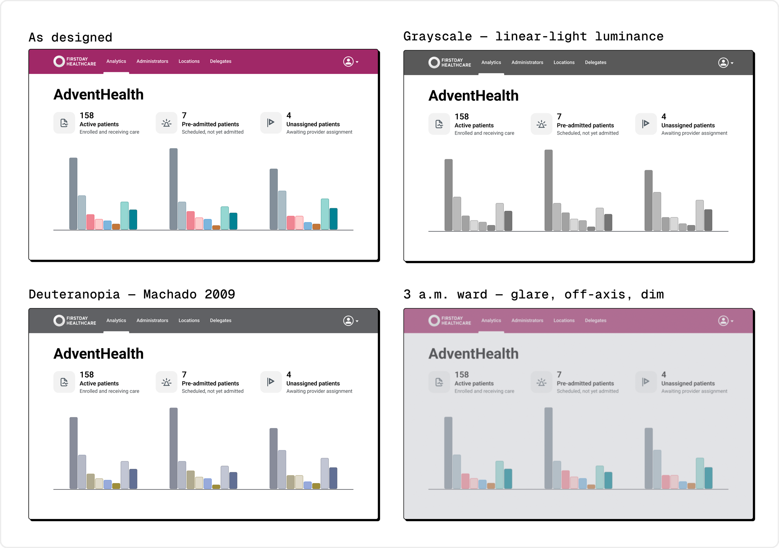
The interface was tested beyond ideal conditions: grayscale, deuteranopia, and a dim, glare-heavy 3 a.m. environment. The information remains legible when color, contrast, and viewing conditions are compromised.
III. The premise: one page because memory is the bottleneck
The legacy product split the account owner's picture across two pages: live metrics on the Dashboard and historical metrics behind a User Analysis page. Each page made sense on its own, but comparison required moving between them.
And comparison is exactly what the account owner needs to do.
This is more than an inconvenience — it is a cognitive constraint.
Working memory can hold only a small amount of information at once, and what it holds is fragile.
When users interrupt their reasoning to navigate the interface, they risk losing the mental context they have already assembled.
Moving to another page creates exactly that interruption.
By the time it loads, the dashboard numbers are no longer visible and must instead be recalled from memory. The comparison shifts from recognition to recall. Nielsen's sixth usability heuristic argues against exactly this pattern: interfaces should minimize memory load by keeping relevant information visible rather than expecting users to remember it across screens.
The redesign therefore begins with a single decision: consolidate the account owner's dashboard items onto one page.
One honest qualification
The consolidated page does not fit in a single viewport. Comparing the census against the chart still requires scrolling, and scrolling still moves numbers out of sight.
Consolidation does not eliminate the memory cost. It reduces it substantially.
The page does not change. The census is still there, in the same place, one flick away. Scrolling is also cheap. No load, no state to re-establish, no decision about how to get back.
So the claim is the narrower one: consolidation converts a navigation event into a scroll. It does not make every figure co-visible.
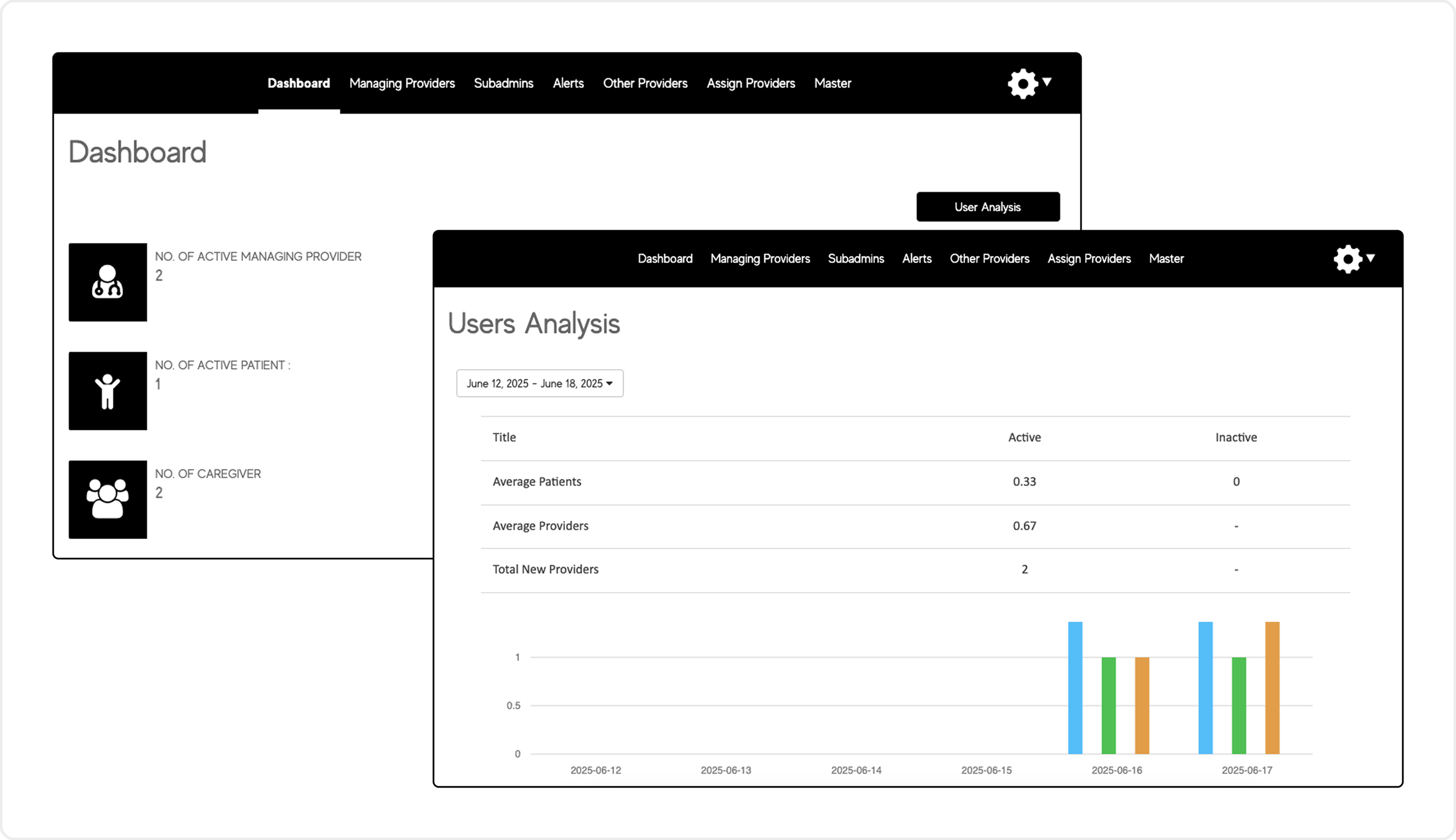
The legacy product split the account owner's picture across two pages.
IV. Design constraints
Constraint 1: the data runs on three clocks
The legacy product never had to say what time it ran on. Each page had separate time model, so the page itself was the label: the dashboard meant now, the analysis page meant the selected period.
Consolidation removes that free labelling.
The moment everything moves onto one page, the question becomes unavoidable: What time does this number belong to?
The answer is different depending on where you look.
Plan and billing ⇢ timeless. No filter touches it.
Patient census ⇢ live, as of the last sync.
Key performance data ⇢ the selected reporting period.
Three time models now share one surface. And none of them is self-evident.
Consolidation only pays off if temporal scope is rebuilt explicitly. The layout has to do that rebuilding: through where the controls sit, what the captions say, and how the sections are placed and grouped.
Constraint 2: grouped data and tables cannot be wide
Reading is not a smooth sweep.
The eye jumps in movements called saccades, pausing between them in fixations. Comprehension happens during the fixations. Within a line, these jumps are short, around 7–8 characters.
The expensive movement is the return sweep: the long jump back to the start of the next line. Its accuracy falls with distance.
On long lines the eye undershoots. It lands mid-line, or on the wrong line, and pays a corrective saccade before reading resumes.
This is why readability research converges on roughly 50–75 characters per line, with 66 as a common target (Baymard; Bringhurst). The pixel width that produces this depends on the font and size, so the constraint is stated in characters, not pixels. WCAG sets the accessibility ceiling at 80 characters per line.
The row is the unit
Tables are the acute case:
Each row must be read as one unit. The indicators table is not three independent columns; each row is a single unit of information. A label and two numbers, read together: fixate the label, jump to Active, jump to Inactive.
Stretch the same three columns to 1064px, as the legacy table did, and the jump becomes about 500px across empty space, toward identical 48px rows separated only by hairlines. The longer saccade sets off a chain:
longer saccade ⇢ more landing error
more landing error ⇢ the eye arrives slightly high or low
from there, one of two things ⇢ a corrective saccade back to the intended value, or an accidental fixation on the adjacent row
the result ⇢ slower comparison, and occasional misreading
At 720px that jump is about 270px, and the row's own text anchors it along the way. None of this happens.
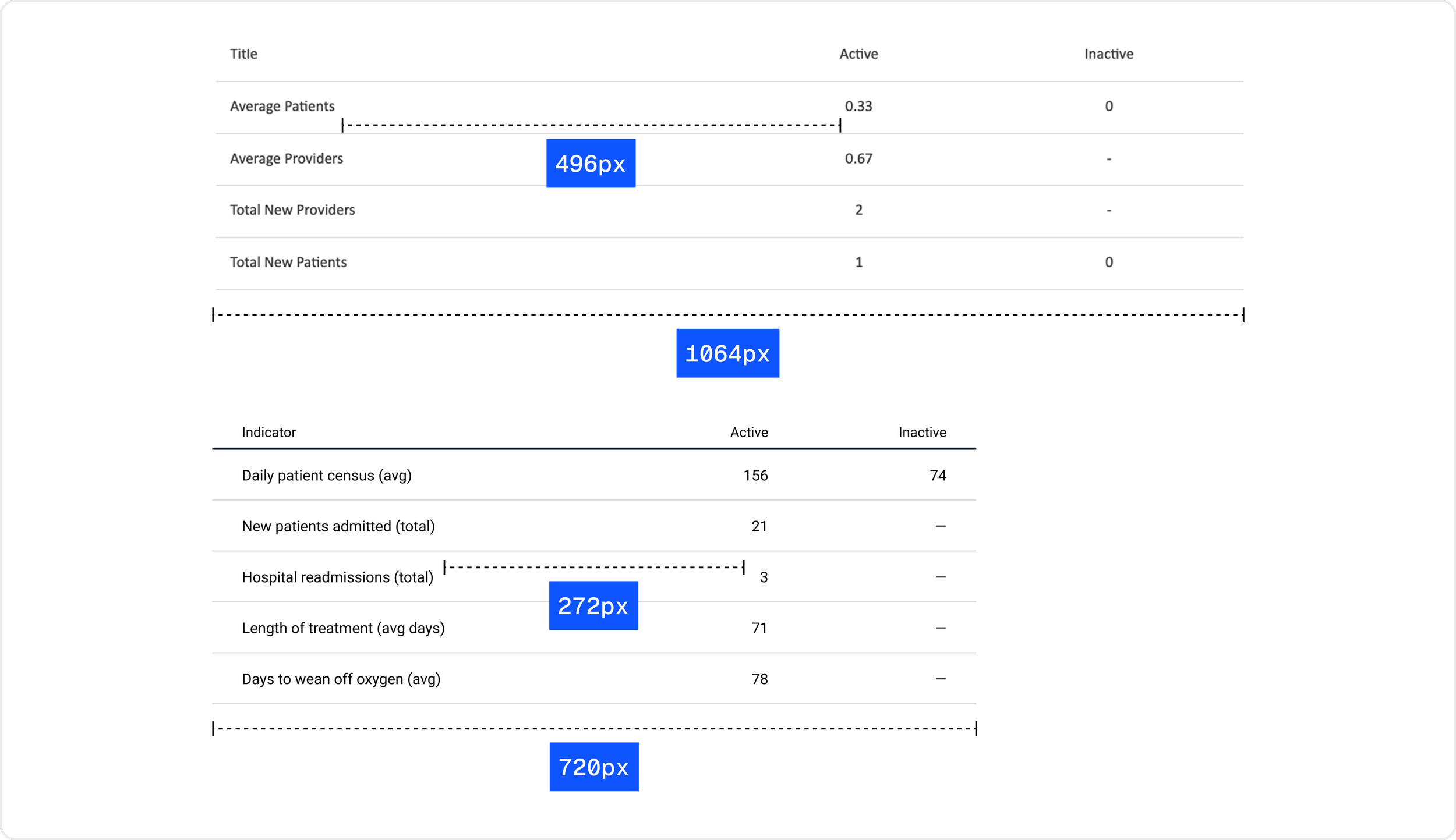
The legacy table at 1064px, above; the redesign at 720px, below. The measurements mark the jump from a row's label to its first value.
The column is the unit
The census grid is bound by the same constraint. It is also the part of the page most easily mistaken for decoration.
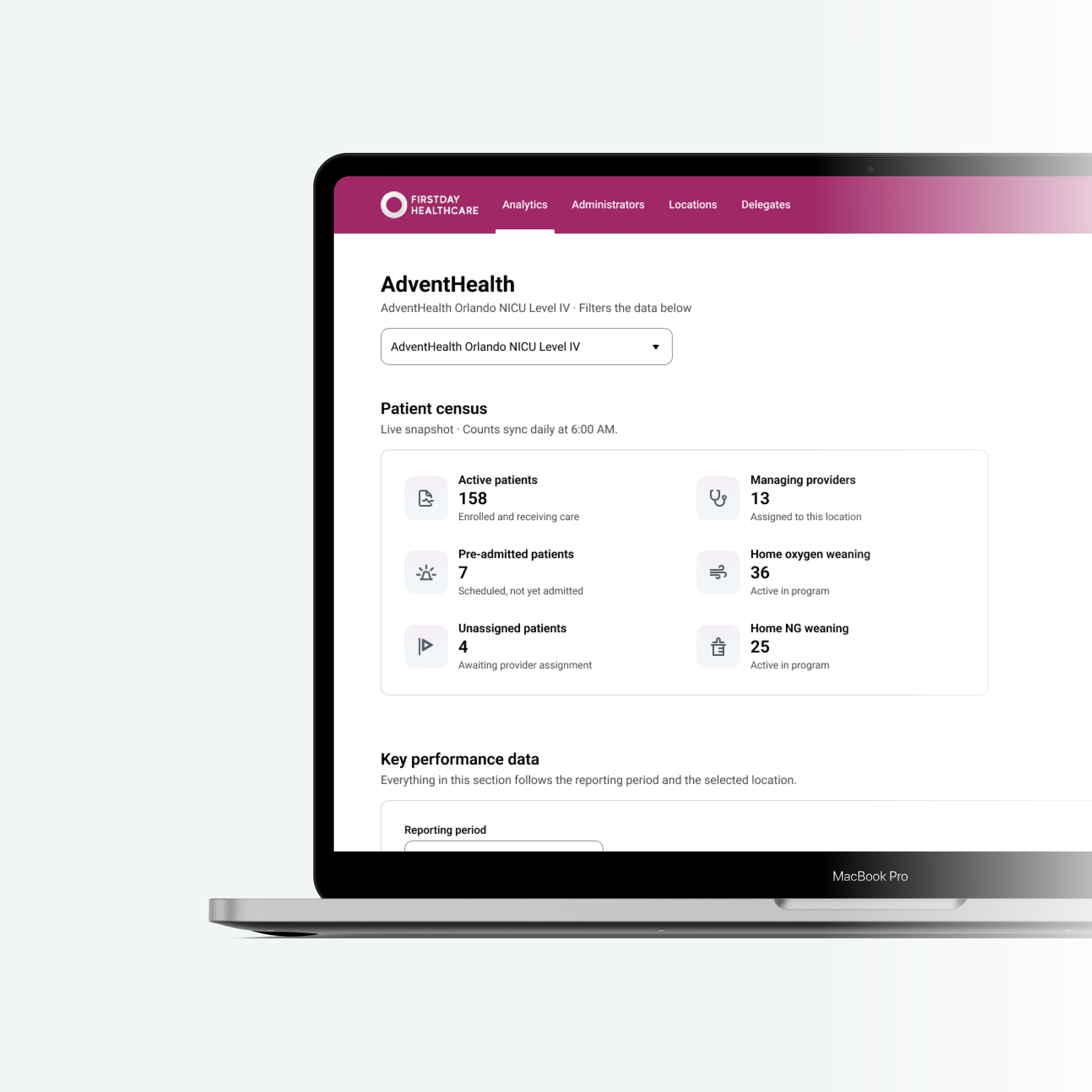
These six metrics are not independent facts. The Account Owner first needs to understand two categories separately, then compare patient counts against managing providers to judge whether the caseload is staffed.
The layout therefore needs to support two reads: a vertical read within each category, and a horizontal comparison between them.
Users read the layout:
In a grid, reading order is designed, not inherited. Decide how the content should be read first, then make proximity, orientation and spacing reinforce it.
The legacy dashboard contradicted that principle. The problem was not the cards themselves, but the structure imposed on them. Although the content was intended to be read across each row, the whitespace organized it into vertical stacks: column gaps measured 244–328px, compared with roughly 36px between rows, a ratio of about 8:1.
The redesign accepted that grouping and reorganized the information architecture around it. The cards became two vertical categories, patients vs programs & providers, so each group could be understood as a unit before comparing patients with providers.
That comparison was then made deliberately cheap. The census pulls in from 1168px to 720px, the column gap drops to 120px, and the patient-to-provider comparison jump shortens by about 58%. Narrow enough that comparing them is a glance.
The census stops reading as six cards and starts reading as one thing.
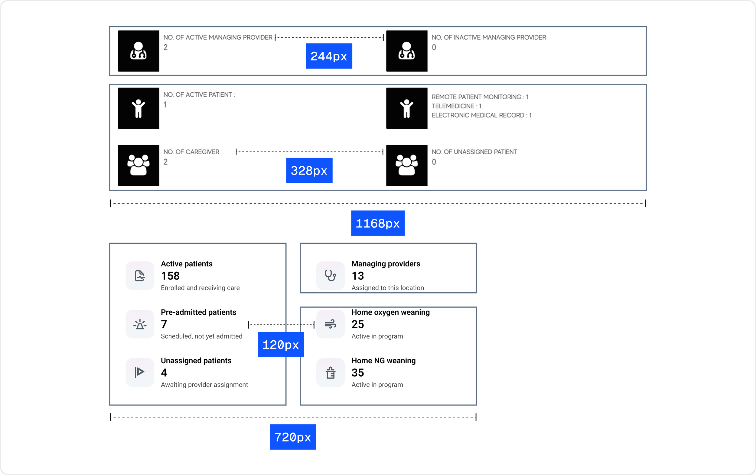
The legacy census at 1168px, above; the redesign at 720px, below. Outlines show the intended grouping: the legacy layout groups metrics across rows; the redesign groups them down columns.
Constraint 3: but the chart must be wide
Constraint two established that the table cannot get wider. The chart will not follow the same limit.
A chart is not read line by line. It is scanned spatially, so width is not whitespace — it is resolution.
Compressing it makes bar width the limiting factor, and with eight series per date group, the densest grain is already at the legibility floor. The chart needs the full width.
The table two inches above it cannot have it.
So the page holds a contradiction. The table must stay narrow to stay readable. The chart must stay wide for the same reason.
The question stops being how wide should the page be. It is how two incompatible widths can belong to the same layout without looking like a mistake.
Constraint 4: one section is gated, the rest are shared
Five roles use this page. The filter, the census, and the performance data belong to all of them. Only the metrics inside differ.
One section does not.
Plan and billing is visible to three roles: a Firstday Super Admin, the Customer Account Owner, and the Delegates that owner appoints.
A disappearing section is a layout problem, not just a permissions problem. Gated content has to be a self-contained section, never half of a shared one.
A shared section that loses part of its contents to gating has to reflow. That is a role-specific layout, and five dashboards to maintain instead of one.
Even done correctly, the block's placement has a cost: wherever it sits, everything below it moves for the roles that cannot see it. Those are the majority: Admins at every hospital site.
V. The layout
Two section widths are already fixed — constraints two and three settled those. The census and indicators table can’t be wide, the chart must be.
What remains is everything else: where the controls sit, what the captions say, what gets a border, and where the gated section goes.
Every number on the page is governed by a filter, or by none. And the layout has to show which, without saying it twice.
Four mechanisms make that legible:
Placement ⇢ a control sits at the head of, or inside, the region it governs.
Labels ⇢ a control gets a visible label only when its value does not already name its dimension.
Captions ⇢ scope is stated once, then inherited downward.
Containment ⇢ where proximity cannot show what belongs together, a border does.
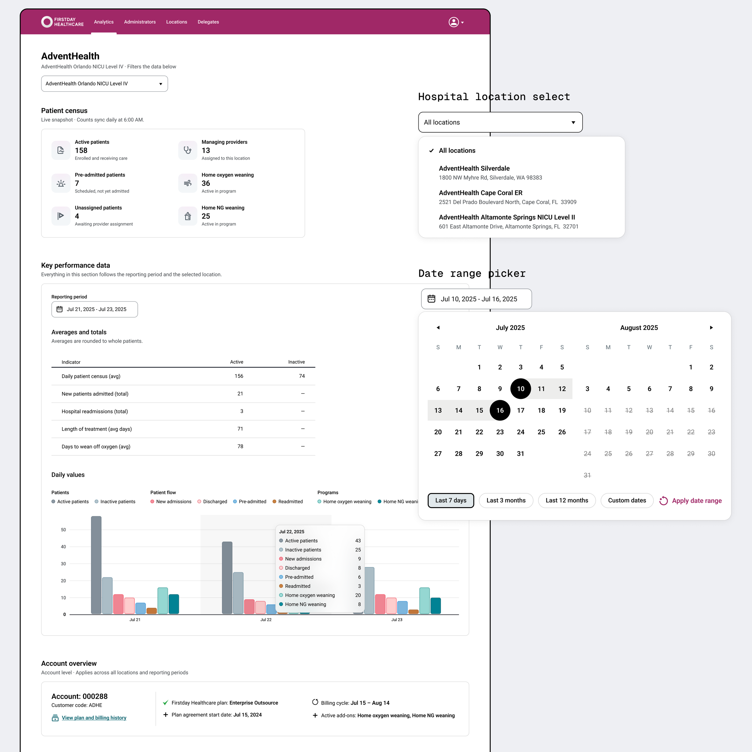
So the location filter heads the filtered region, while the reporting-period picker sits inside the performance card above the table and chart it governs.
Altamonte Springs NICU Level II names a place, so it needs no visible label. Jul 17 – Jul 23, 2025 names only a date range, and this page carries three, so it keeps one. This works because there is exactly one location filter; add a second dimension and the labels return.
Scope is stated only where it changes.
The census declares its own clock because it differs from everything below it. The table states its data rules. The chart says nothing at all. It sits inside the picker's border and inherits.
The border does a second job
The performance zone is the only bordered region. It was introduced to bind the reporting-period picker to the table and chart. But it also absorbs the width mismatch.
The table stays at 720px while the chart runs to 1168px. The border makes the table’s surrounding whitespace read as intentional padding rather than an orphaned narrow element beside a wider chart.
Everywhere else, proximity is enough.
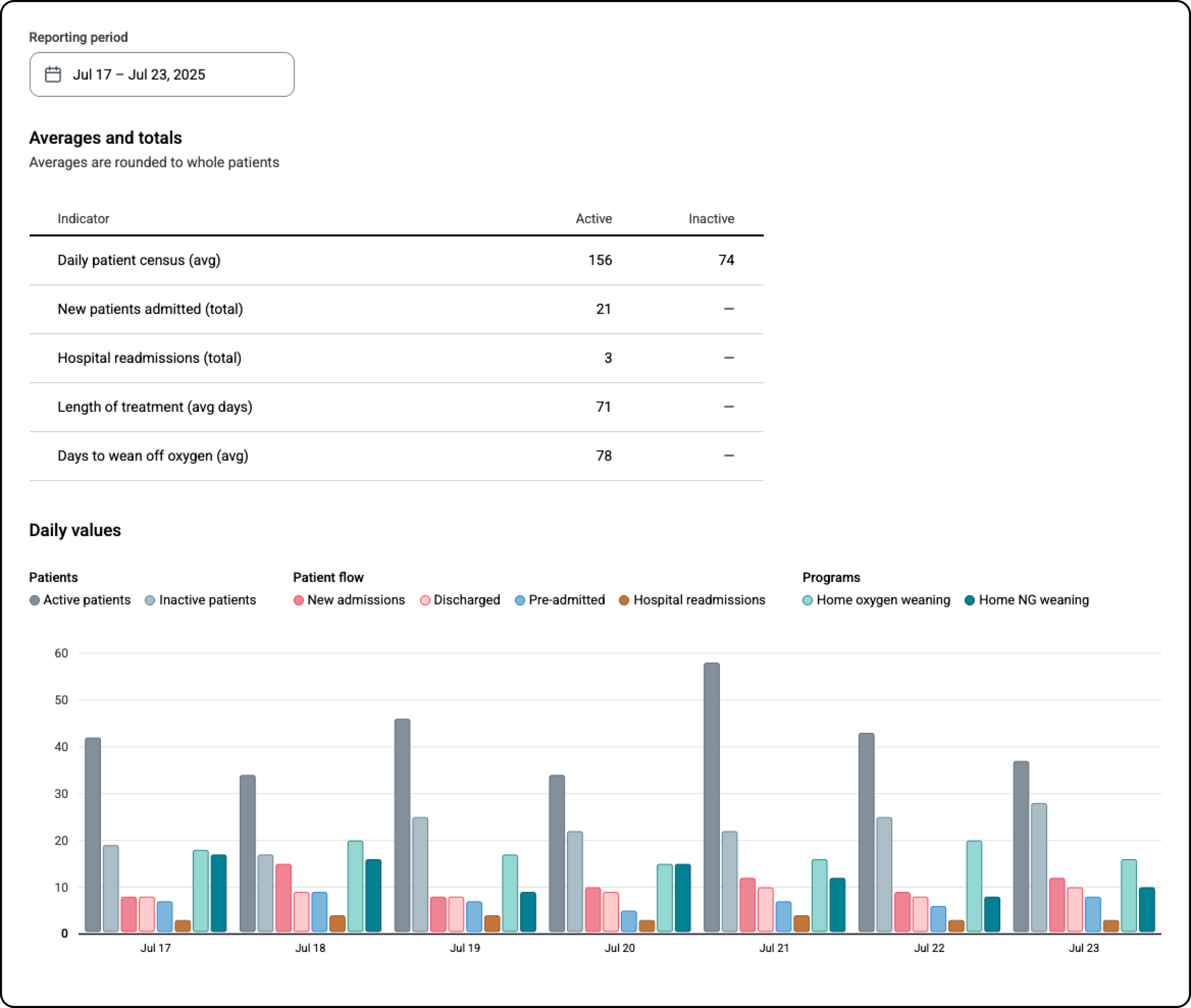
The performance section's border absorbs the mismatch between the table and chart widths.
VI. Choosing the arrangement
Two layouts were built.
Option A: gated section first
Option A places Plan and billing above the location filter. The block is timeless: no filter touches it. Everything below the filter is scoped by it, making every scope claim on the page unconditionally true. Nothing above the location filter is filtered. The label can say applies to all data below and mean it literally. No exception clause.
Structurally, this looked like the answer, and it held the design for some time.
It wasn't.
The problem was visual.
The account card, filter, and census all run narrow before the page opens up at the performance box, leaving substantial unused space on wider screens. The imbalance becomes increasingly pronounced with viewport width, from tolerable at 1280px to dominant at 1920px. With institutional desktops overwhelmingly using 1080p, the wider case was treated as the common one.
The only way to fix that rhythm is to widen the census, which constraint two forbids. It was tried anyway. Widened, the census stops arriving as a group and loses its reading order, exactly as constraint two predicts.
The rescue route is closed.
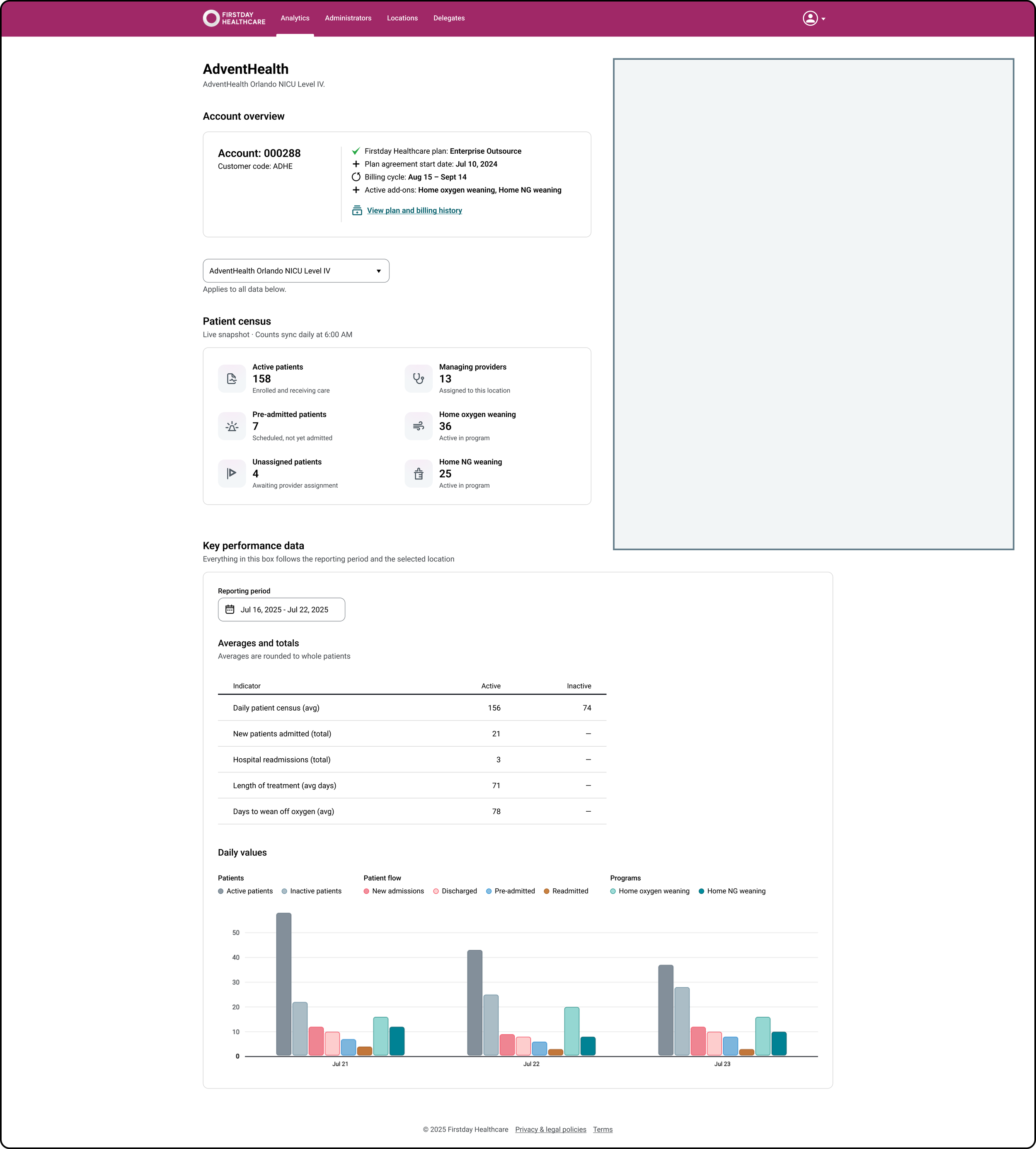
Option A at 1920px. The page runs narrow through the account card, the filter, and the census before it opens at the performance box.
Option B: gated section last
The Plan and billing block moves to the foot of the page, below the filter. The filter's claim becomes narrower, filters the data below, while Plan and billing at the very bottom declares its own scope at its own boundary: Account level · Applies across all locations and reporting periods.
The page rhythm resolves.
Because the block sits at the end, removing it for roles that don't have access changes nothing at all.
The decision
The two options are not strong in the same dimension.
Option A has the stronger information architecture. Every scope claim on the page is literally true.
Option B has the stronger composition. It introduces one local exception: the filter no longer governs the final section, which declares its own scope instead.
The choice therefore comes down to where each cost is paid.
Option A's cost is global. The rhythm penalty is present on every screen, in every session.
Option B's cost is local. One section declares its own scope. This introduces a small inconsistency to the page's information architecture, but it is bounded to that section and immediately explained by the section's label.
Costs paid continuously outweigh costs paid once, locally, with an explanation attached.
Option B was selected.
The page therefore reads, top to bottom: location filter ⇢ patient census (720px) ⇢ key performance data (1168px, boxed) ⇢ Plan and billing (1168px).
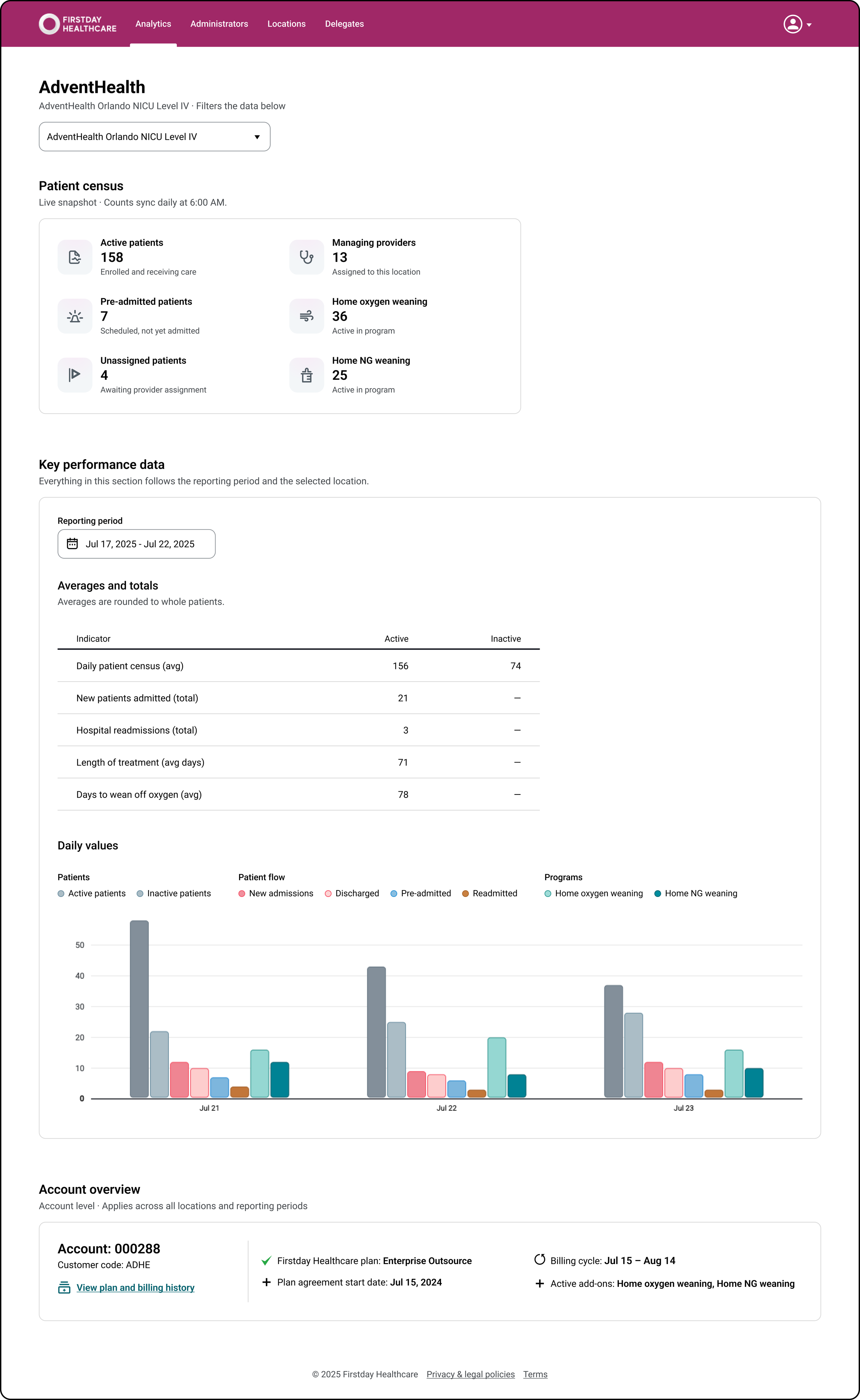
Option B. One narrow section, then full width to the foot, with Plan and billing declaring its own scope at the end.
VII. The chart
Encoding
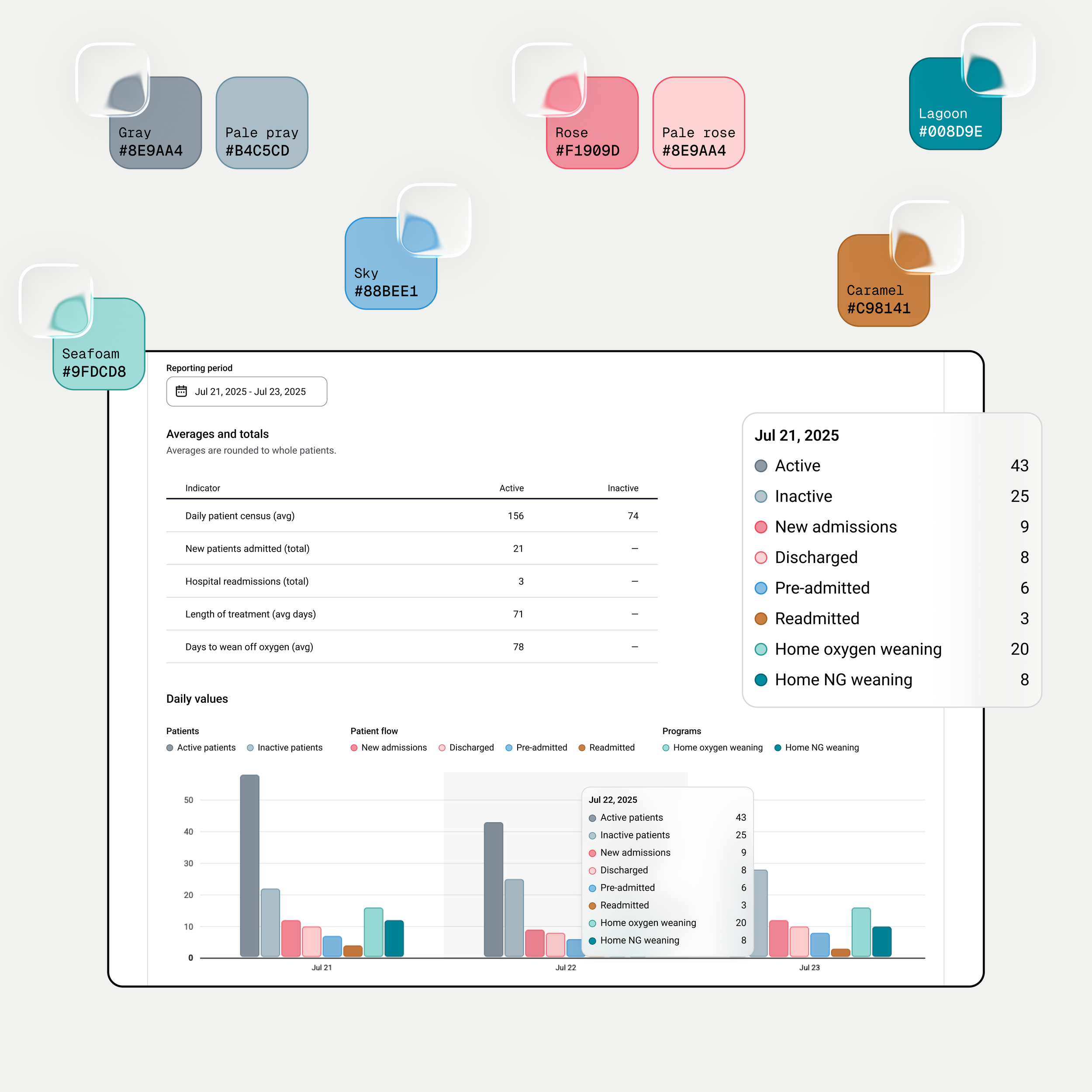
Eight series, four groups: providers, patients, patient flow, and programs.
Two groups contain a state pair — two states of one entity. State pairs share a hue and differ in lightness: the darker color is the parent, the lighter its twin.
The idea is inherited: the legacy charts already drew inactive counts as pale shades of the same color. A sound instinct, but without a legend, nobody could learn the code.
The redesign keeps the idea and constrains it. Only states of the same entity share a hue. The grouped legend teaches this relationship, with its order matching the order of the bars.
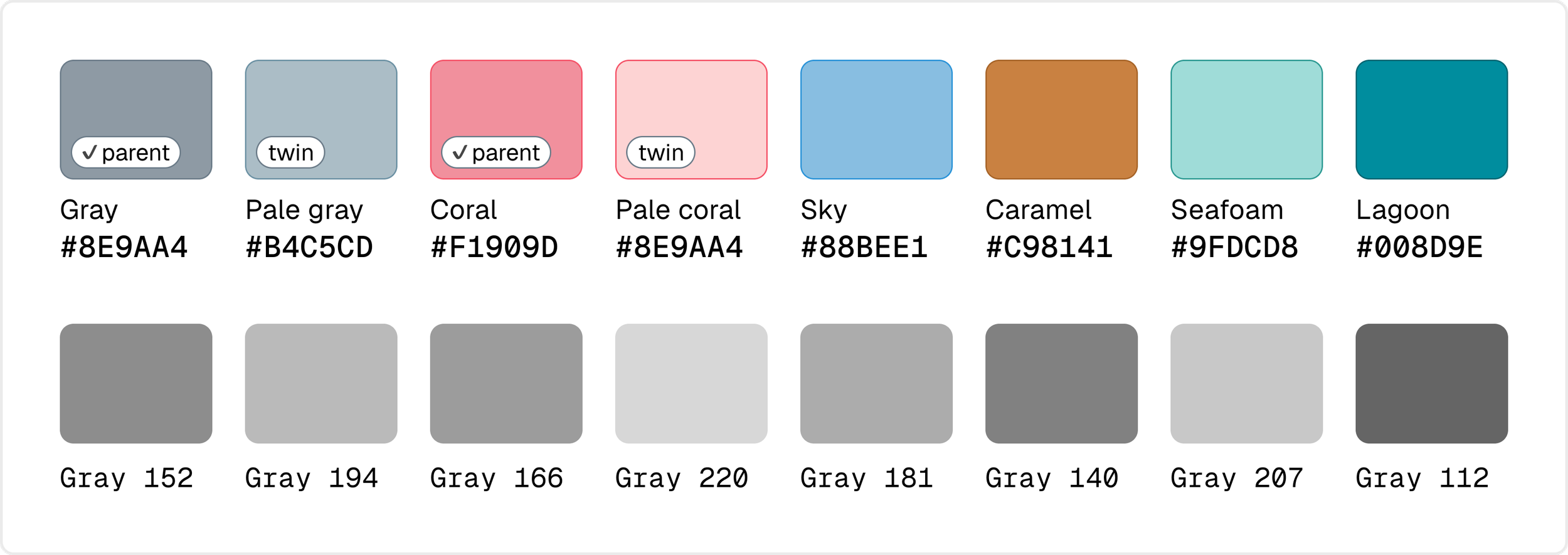
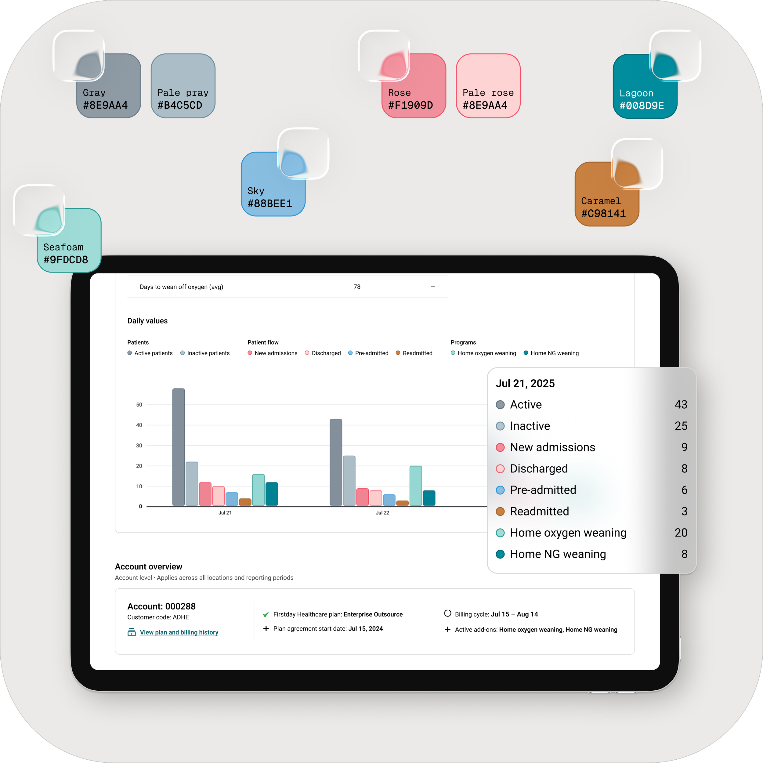
The eight fills with their respective borders, border contrast ratios, and grayscale lightness, shown in bar order.
Every candidate was simulator-tested under deuteranopia, protanopia, tritanopia and grayscale.
The tightest pairs are gray against caramel in grayscale, and pale gray against seafoam under deuteranopia and protanopia; both stay separable because legend position and borders carry identity alongside the fill.
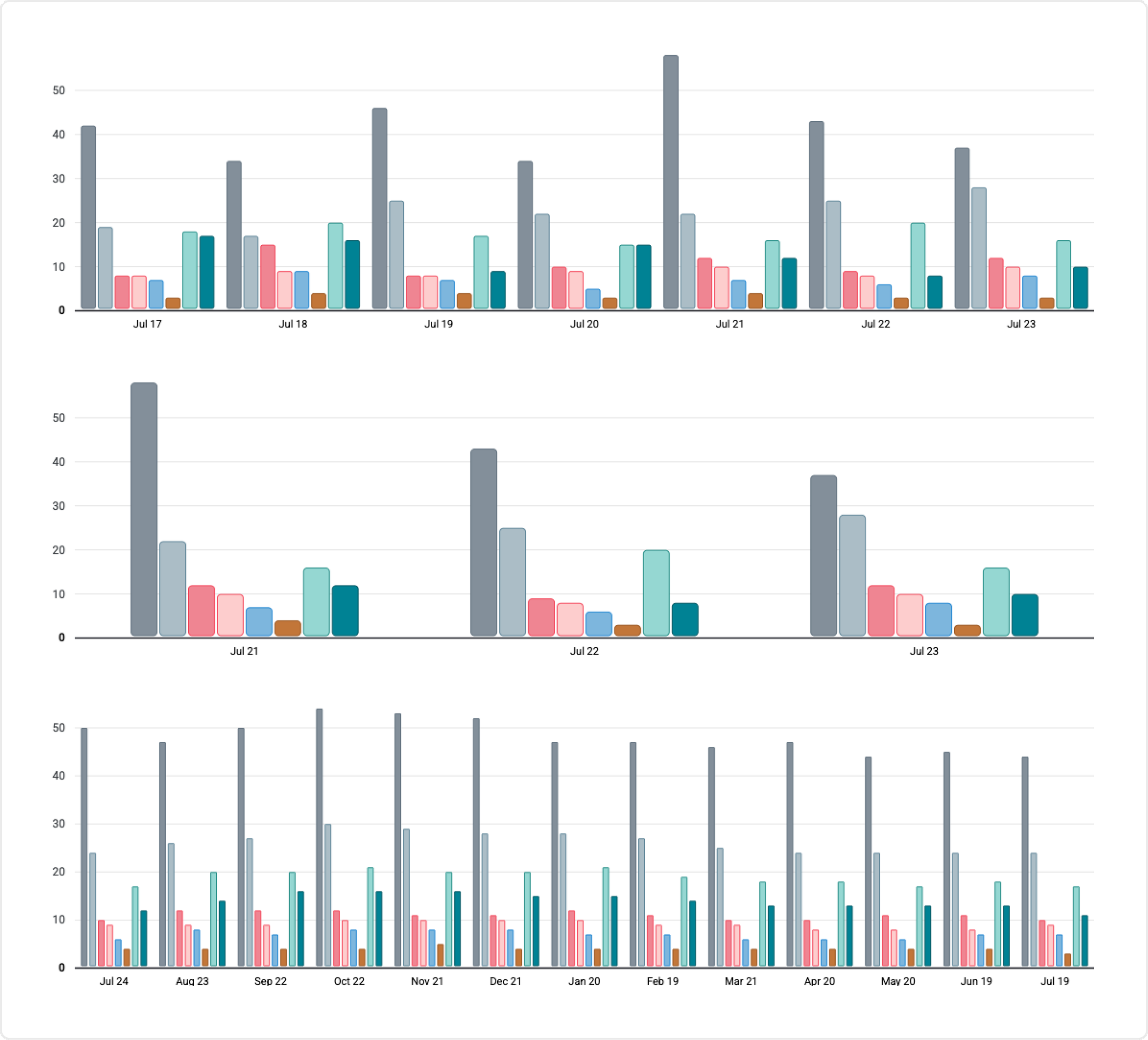
The same chart at three periods, from the working prototype: seven days, three days, and twelve months.
Reading exact values
Eight 7px bars can be compared, but they cannot be read.
Hovering anywhere within a date group reveals every series, with its swatch, label, and value, in bar order. The hit area is the whole column rather than the individual bars, so reading a value never depends on hitting a 7px target.
The panel is a convenience layer, not an accessibility mechanism.
It disappears in print, and right now it is the only route to an exact value.
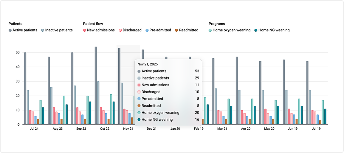
The shaded band is the hit area: the whole date group, not the individual bars. Values are listed in bar order, so the panel reads in the same sequence as the chart.
Color
All colors must stay distinguishable under fatigue, on bad hardware, in grayscale, and to a color-blind reader.
Four constraints shaped the palette.
➣ 1. Contrast. Text follows WCAG AA. Bars require 3:1 against the page, which the current build achieves with borders rather than darker fills. If a data table is added later, the borders become unnecessary.
➣ 2. Grayscale. The chart is routinely printed and photocopied. Each fill therefore occupies a distinct lightness rung, so the legend stays matchable without color.
➣ 3. Color vision deficiency. Bar order is constant and the legend mirrors it, so every series can be identified by position rather than color. Candidate palettes were rejected if any two series became confusable under deuteranopia, protanopia, or tritanopia.
➣ 4. Visual weight. The brand’s magenta already carries the page’s strongest visual weight. The chart stays light so it supports the hierarchy instead of competing with it.
The palette is whatever survives all four at once.
It’s seeded from the product's existing color tokens rather than new accents.
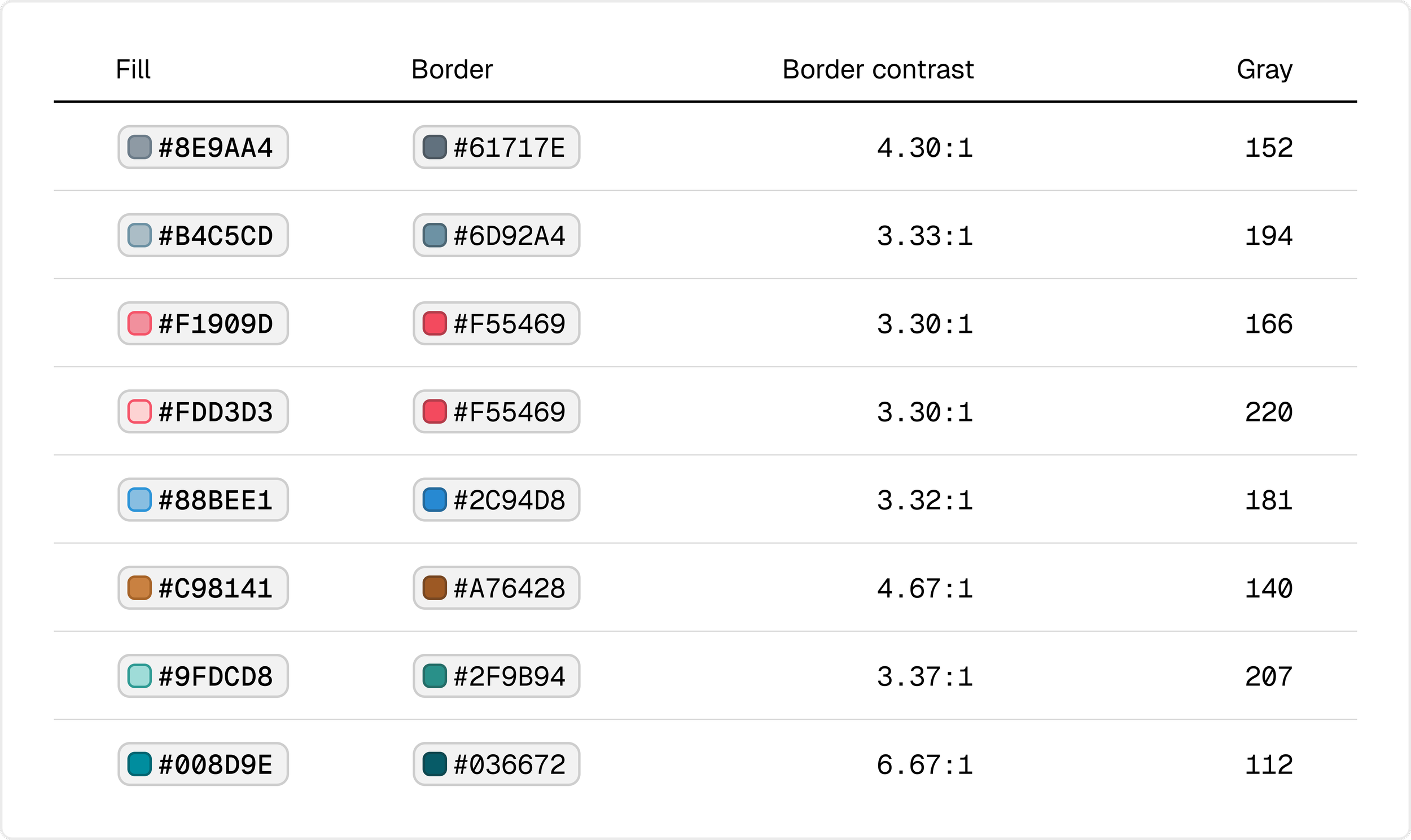
The eight fills with their respective grayscale lightness values, shown in bar order.
Grain
The chart adapts its grain to the selected period: daily to a week, weekly to three months, monthly to twelve.
These thresholds are derived rather than chosen.
Eight series per group, a minimum readable bar width, and a separation gap between date groups determine the maximum readable range of the chart. The same calculation sets the twelve-month limit for custom ranges.
Beyond that, grouped bars stop being the right instrument.
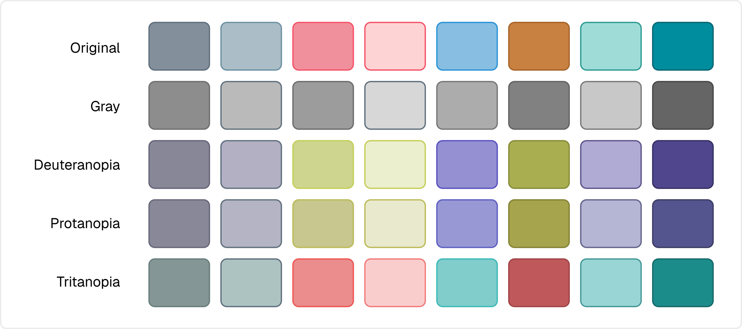
The eight fills under grayscale and the three forms of color vision deficiency: deuteranopia, protanopia, tritanopia.
Governance
Color belongs to metrics, not positions. Metrics that can appear together never share a token.
New tokens are simulator-tested against the existing palette before adoption.
VIII. Limitations
This work shipped without direct access to users or product analytics. The arguments in this case study are therefore perceptual and structural rather than behavioral. They explain why a design should be easier to read, not whether users actually behaved differently after launch.
This may seem like an excessive amount of thought for a small number of pixels, but that’s intentional and representative of my design process.
I’m fairly obsessive about what earns its place on the page: there’s a reason behind every element and where I put it.