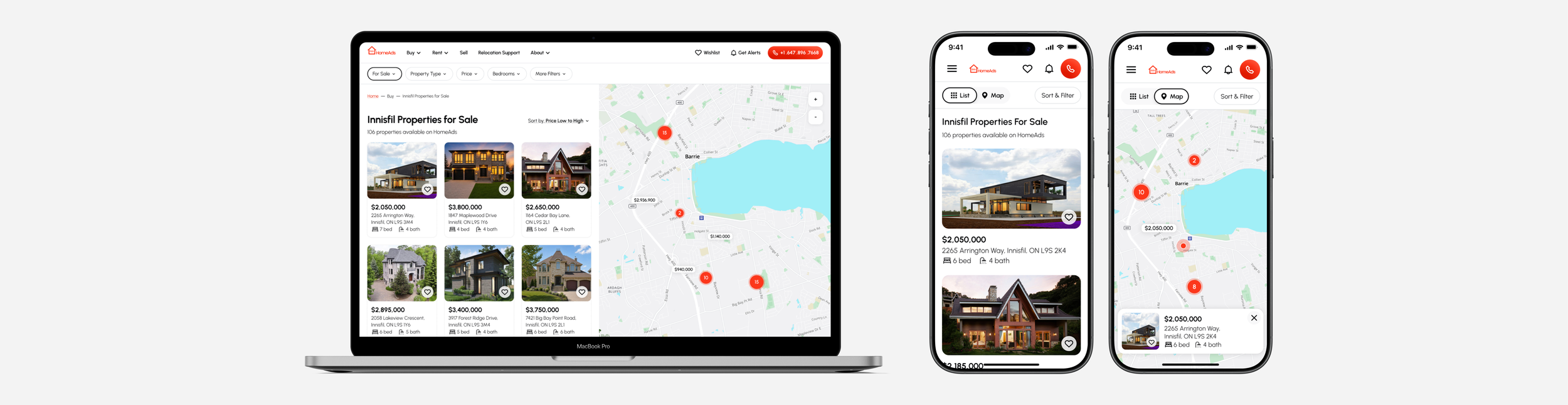
HomeAds: real estate agency website
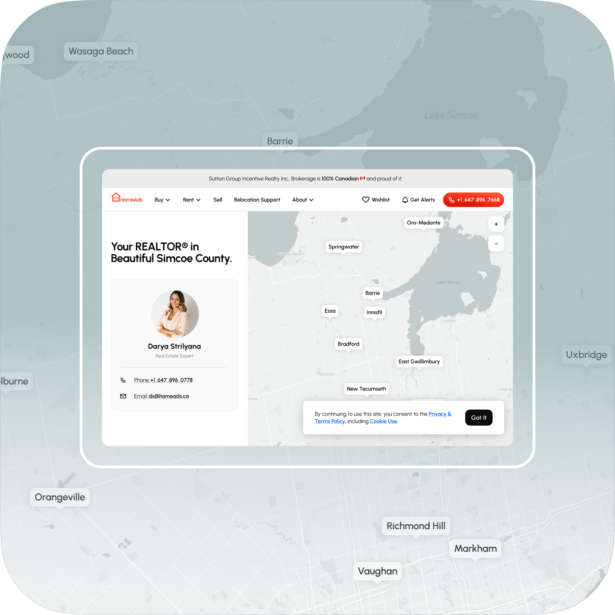
Overview
Industry: Proptech · Hospitality
The scope: Redesign HomeAds’ navigation, filtering, and core interface, and establish a new visual language across the product.
Role: Product Designer (end-to-end UX/UI, research, visual design)
Type: Live product · homeads.ca
The context
HomeAds is a privately owned real estate agency website held back by an outdated design and overall UX. Its functionality involves:
⇢ Helping users find properties in the GTA to buy, rent and sell
⇢ Educating users on the process of selling and buying
The scope
➣ Improve the HomeAds website’s UX in terms of navigation, filtering, and aesthetics
➣ Help build the business’s credibility in the industry and increase user trust, engagement, and conversions.
The constraints
HomeAds housing market information originates directly from the MLS® (The Multiple Listing Service®) database, the most powerful real estate marketing system in the country. Data-heavy content will surely result in high development costs. Due to my clients’ budgetary restrictions, it was specifically discussed not to add any new functionality for now and work with what they already had.
The process
Even though I don’t believe in a one-size-fits-all approach, my process is deeply rooted in classic design thinking methodology and consists of 4 (four) phases:
⇢ Setting the task and deliverables; researching the target market niche, competitors and end-users
⇢ Defining information architecture, functionality and user flows
⇢ Drafting a functional lo-fi protototype
⇢ Crafting brand visual identity and putting together hi-fi wireframes
I. Understanding + research
I began by reviewing all assets my client had available, including their existing website and its analytics, to gain additional insight into how the site was performing.
Audit, testable hypotheses and validation
Based on my findings, I formulated testable hypotheses and challenged my client with the usability testing. Tasks were all straight-forward and aimed at proving the hypotheses.
The purpose was by no means to showcase the website’s shortcomings. Rather, it stemmed from my belief that visuals often convey meaning more effectively than a purely verbal description.
Primary scenario: Send a viewing request for a 4-bedroom rental townhouse located anywhere in the Greater Toronto Area.
Hypotheses:
➣ 1. As shown in the screenshot below, rental properties were inaccessible through the global navigation and could only be found by filtering properties for sale. This made the rental discovery path unclear and could cause confusion for users looking specifically for rental properties.
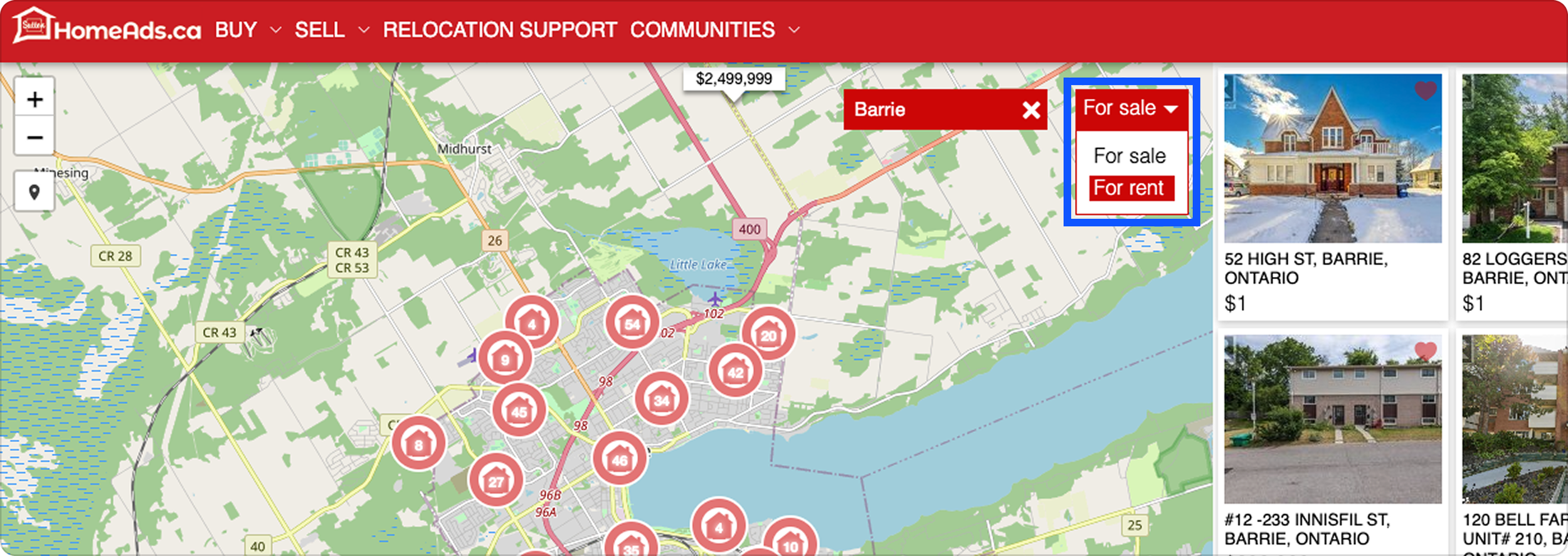
Rental properties are inaccessible through global navigation and can only be reached by filtering properties for sale.
➣ 2. Global navigation dropdown menus contained items that logically belonged to filters (such as amenities and prices).
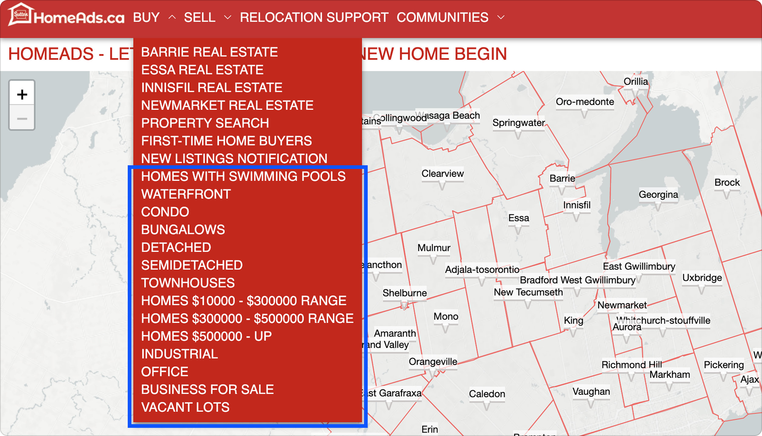
Global navigation dropdown menu contains filtering options.
➣ 3. Redundant filters added clutter. For instance, a “condo” property feature was found in both “type” and “land type” filters. Same applied to For sale/For rent and price filters located both at the top and bottom of the screen. Coupled with the obvious lack of filtering options in some filters and unnecessary units in others, it would add even more confusion to the search modification flow (not to mention unclear definitions for someone who is not a real estate professional).
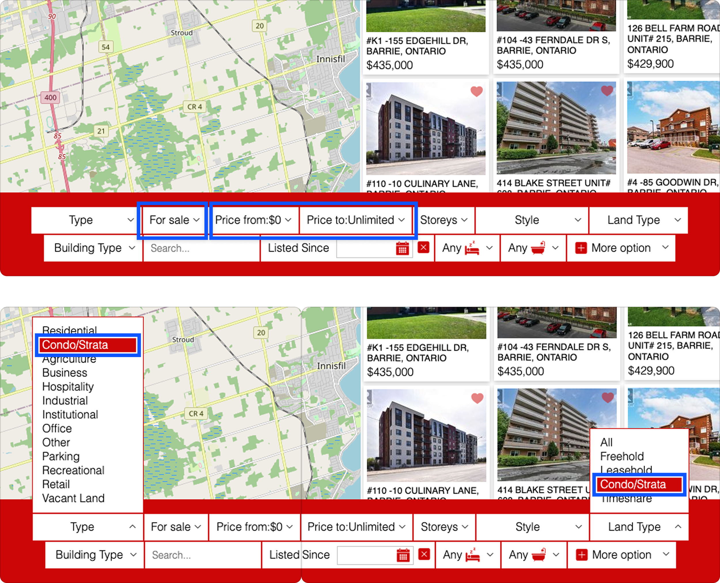
Global navigation dropdown menu contains filtering options.
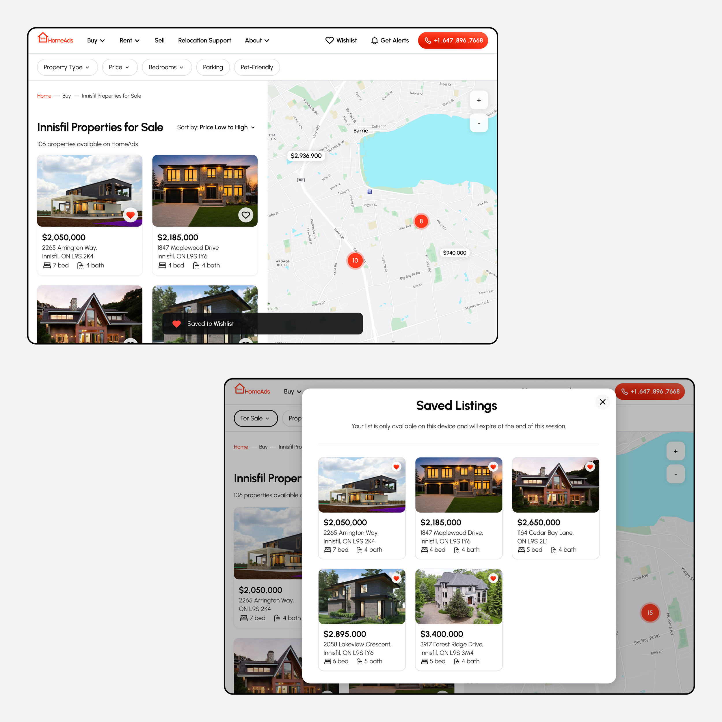
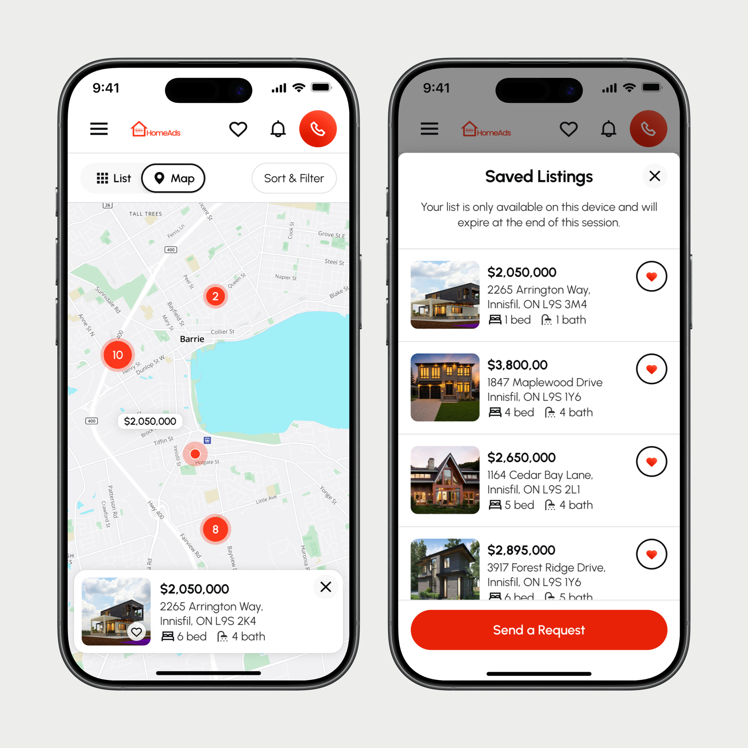
➣ 4. Wishlist function wasn’t working on mobile making remembering each liked listing a daunting task.
➣ 5. The link to About Us page (the presentation of the business to the prospective customer) was buried in the footer among plethora of other links, hence was nearly impossible to find.
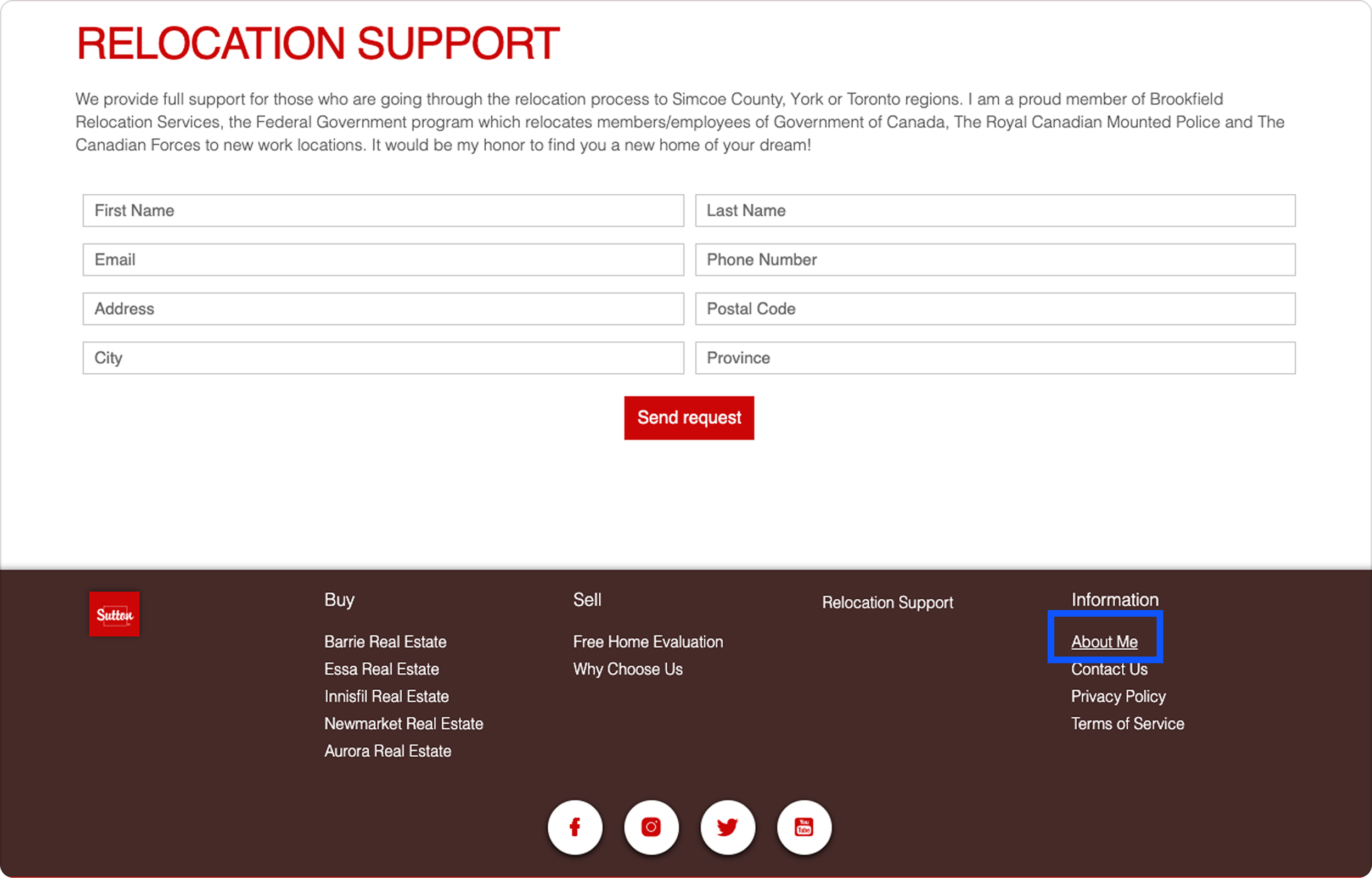
The About Us page is buried in the site footer, making it difficult to discover.
➣ 6. “Subscribe to New Listings” CTA link was hidden among multiple dropdown menu items, drastically limiting its visibility.
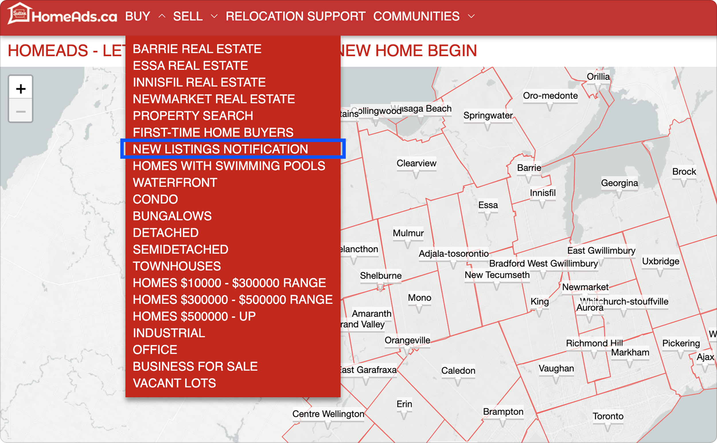
“Subscribe to New Listings” CTA link is only accessible through the global navigation dropdown menu.
My client failed to complete the scenario tasks on their own website and proved my hypotheses were correct. Moreover, this approach allowed my client to be the part of the process and helped us align on the next step goals: rework information architecture and reword all real estate professional terms, concepts and jargon to make them appear familiar to the user.
II. Information architecture
Composing the information architecture is a crucial part of the process. It establishes a solid foundation for the website and eliminates as much ambiguity as possible by ensuring that information is organized logically and that the hierarchy is clear. It’s also an important opportunity to collaborate with the client, validate assumptions, and surface additional questions.
At this stage, I usually use FigJam, which allows me to work collaboratively and iterate quickly as the structure takes shape.
I started by collecting the information that needed to be presented on the website and documenting all the elements required on each screen, including both content and functionality. This helped me prioritize information and define the top-level navigation, contextual menu items, and filtering options.
Below is the sitemap and information architecture I arrived at.
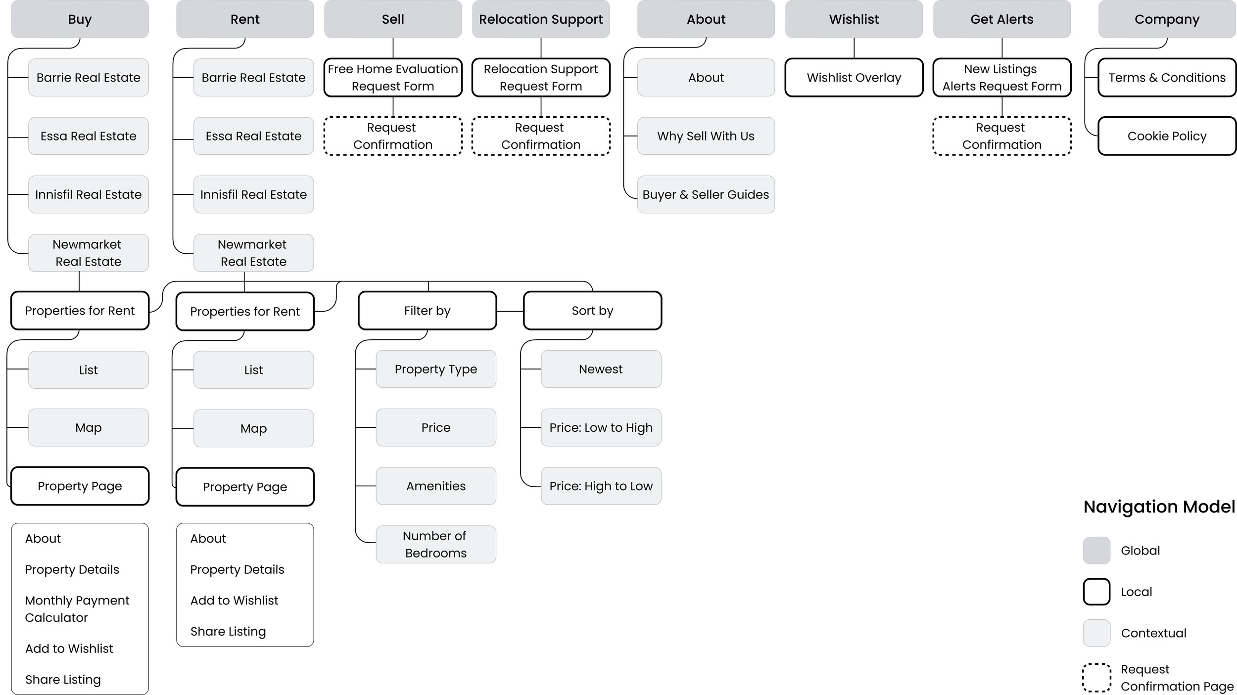
HomeAds sitemap.
III. Responsive breakpoints
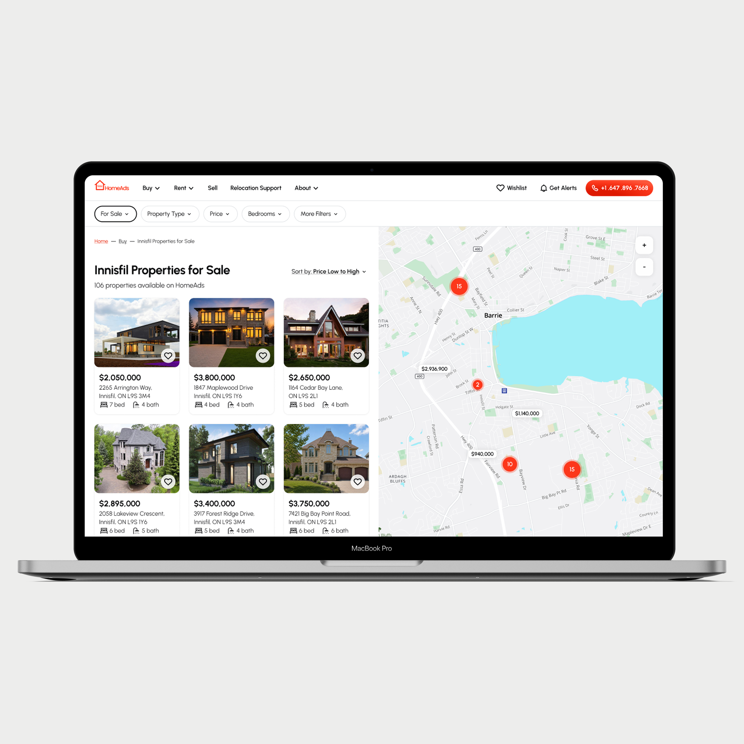
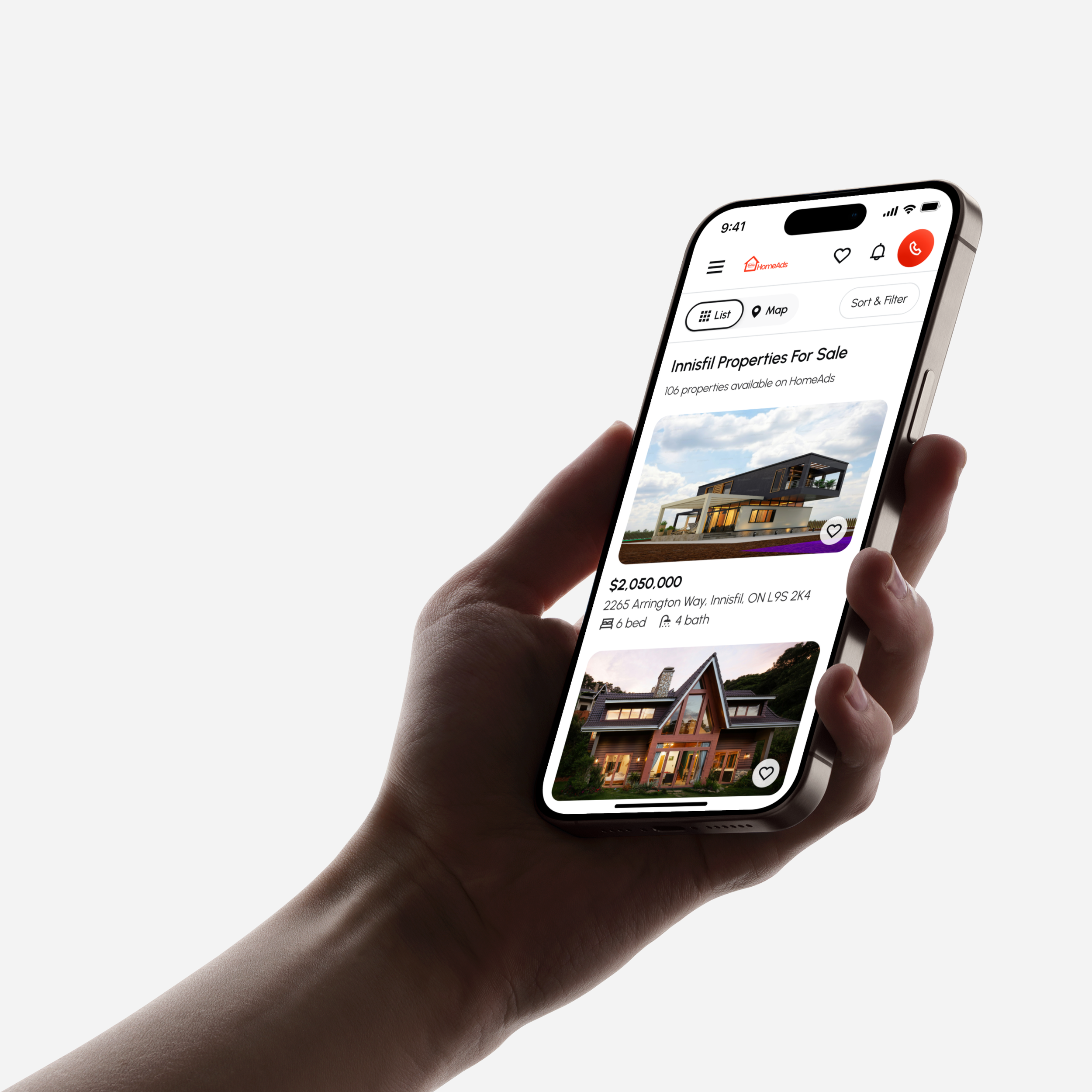
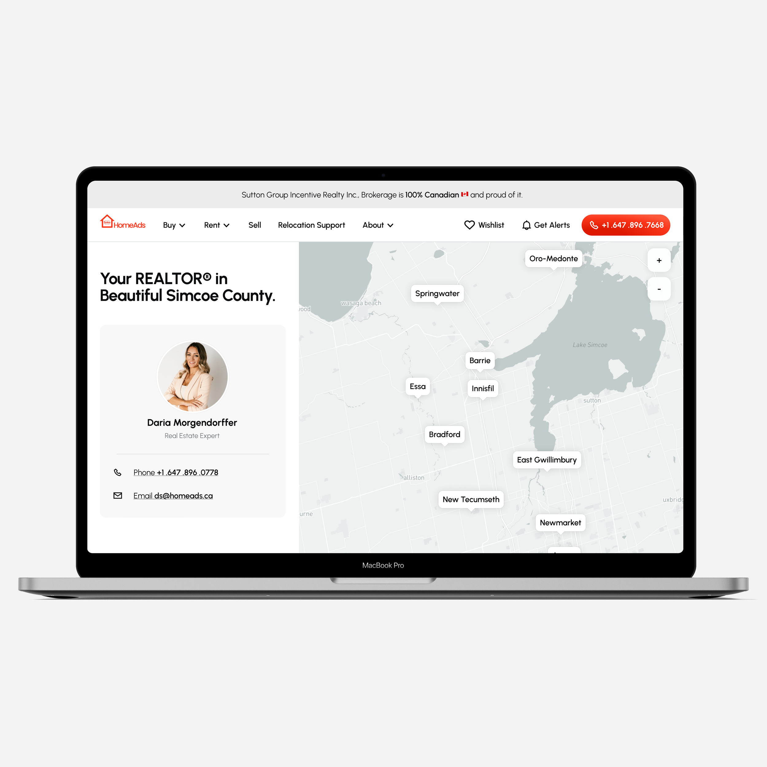
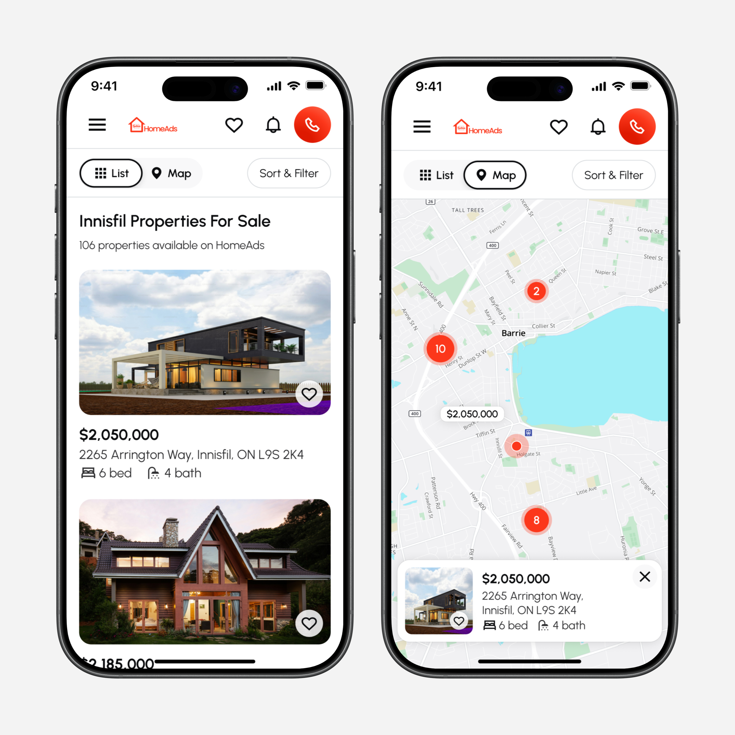
HomeAds utilizes both fixed and fluid grid (for example, to maximize screen real estate on complex desktop screens that include maps).
Number of viewports: 4 (four)
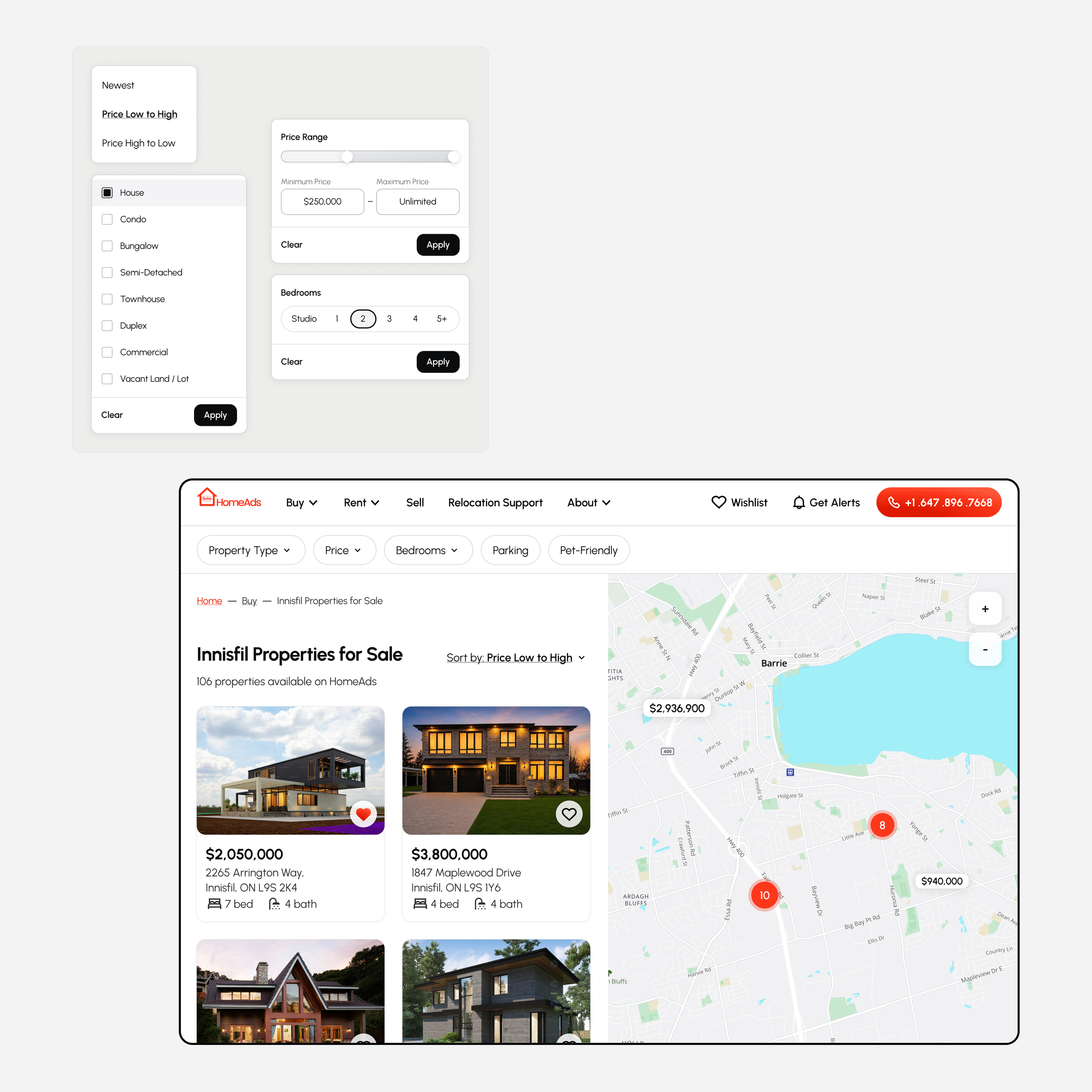
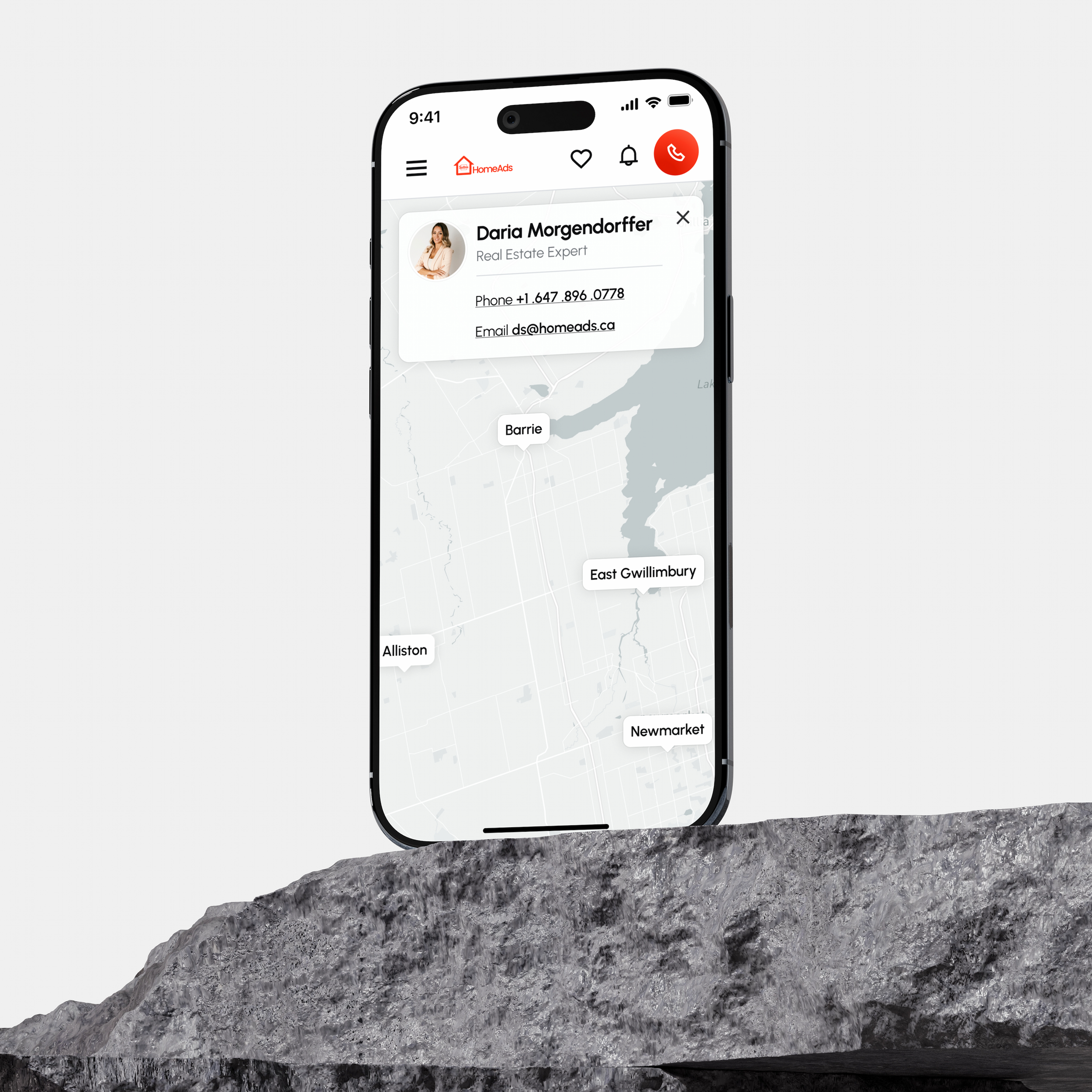
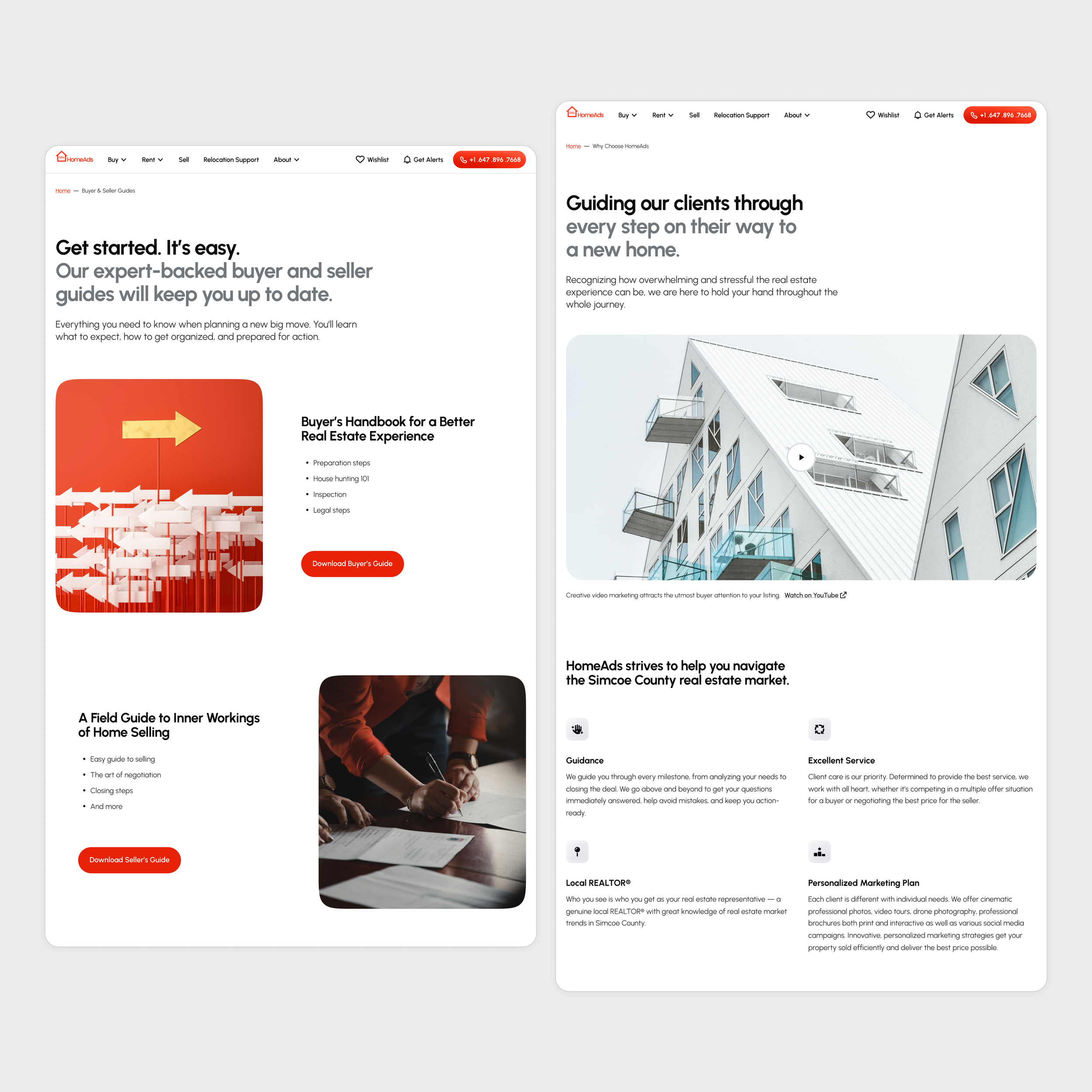
IV. Wireframes
Headline hierarchy
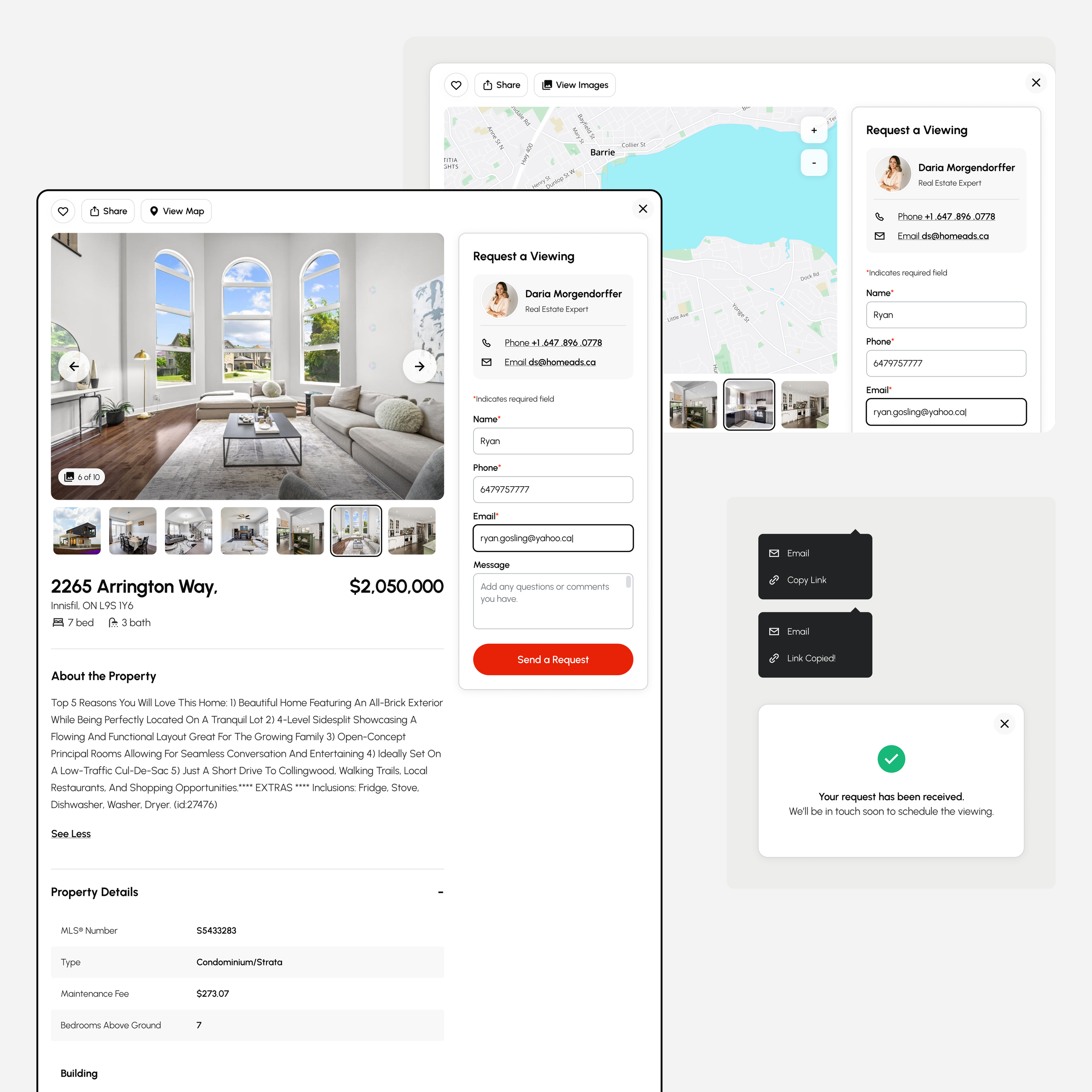
Proper headline hierarchy has been built into the design system. The main heading is the content heading, which is rank 1 (<H1>). The subheadings in the content are rank 2 (<H2>) as are all the other structural headings. I’ve also made sure that an <H1> is not followed directly by an <H3>, for example (skipping heading ranks can be confusing and should be avoided where possible).
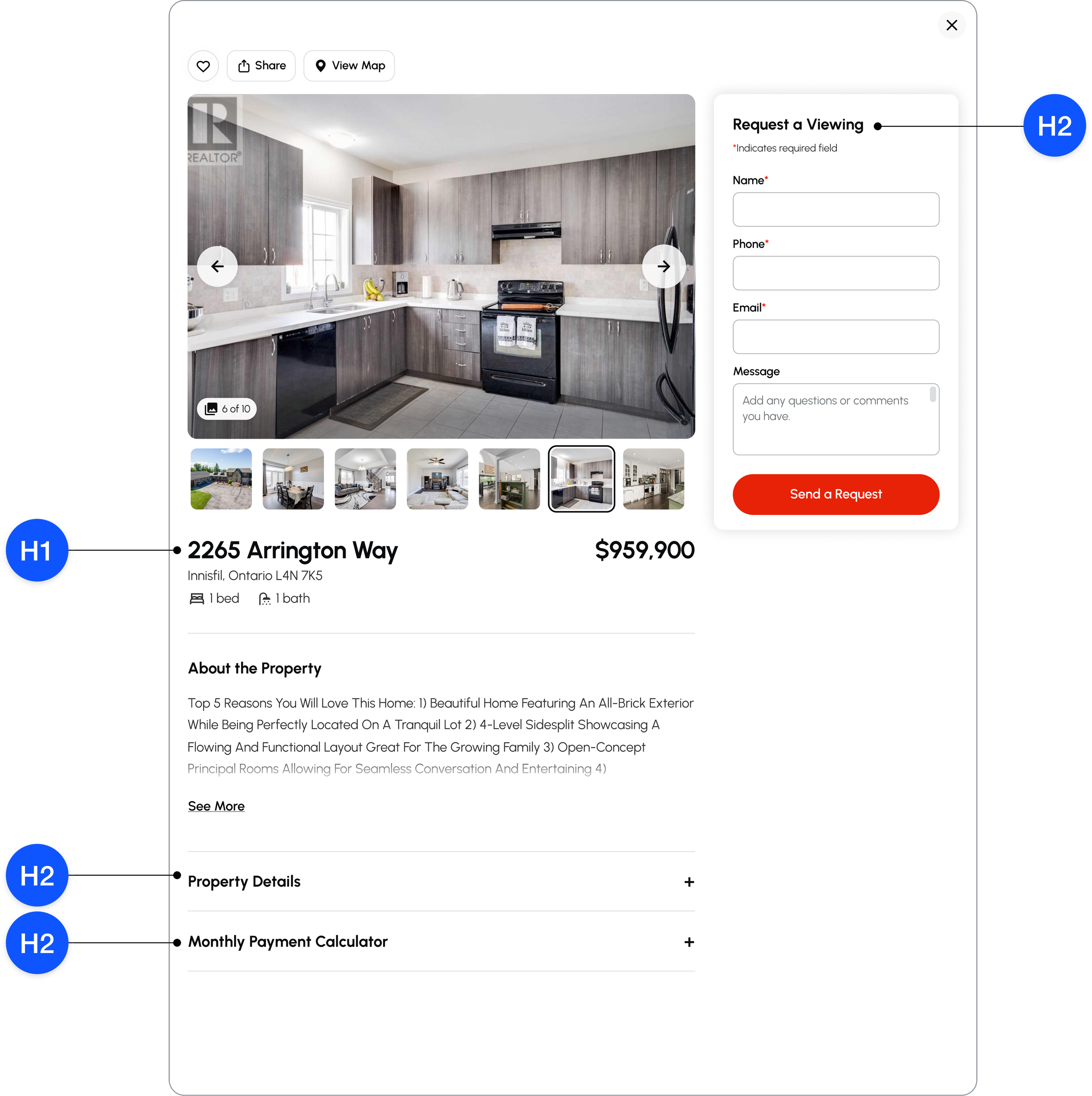
Headline hierarchy on property page.
Designing better input fields
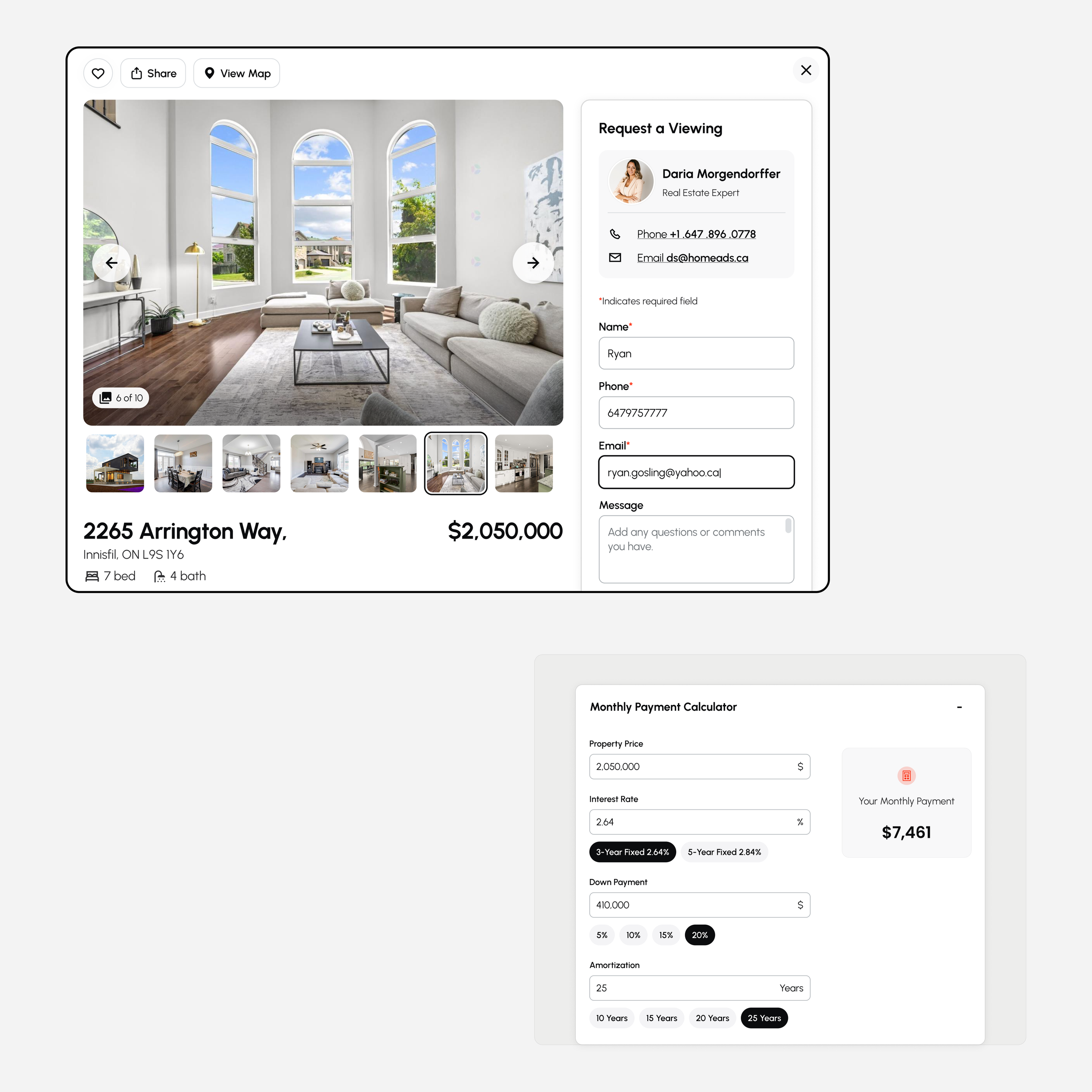
➣ 1. The first thing that drew my attention was the fact that required field indicators were missing. Nielsen's fifth usability heuristic for interaction design is error prevention. Good error messages are important, but the best designs carefully prevent problems from occurring in the first place.
According to NNGroup’s research, “It is dangerous to not mark the required fields in forms. Forms vary a lot across sites — different companies require different types of information. If the form looks like a login form, it’s safe to leave the required information out. But if it does include more than the username and the password fields, mark all required fields.”
TL;DR: Be as explicit and transparent as possible: for every single field that must be completed, mark it as required.
➣ 2. While placeholder text provides valuable guidance for many users, placeholder text is not a replacement for labels. Placeholders that disappear as soon as the field comes into focus are inaccessible, even to seeing users.
If the placeholder text contains instructional information or examples that disappear, it makes it more difficult for users to check their responses before submitting the form. All the instructions, hints, and notes regarding filling a form or taking any other action should always be permanently visible at any point in time.
➣ 3. Placeholders—if they contain information important for completing a task, should adhere to the high-contrast standards, but not appear too bright. The new placeholder in the message text field has contrast ratio that’s high enough (4.5:1), but it still looks muted compared to labels.
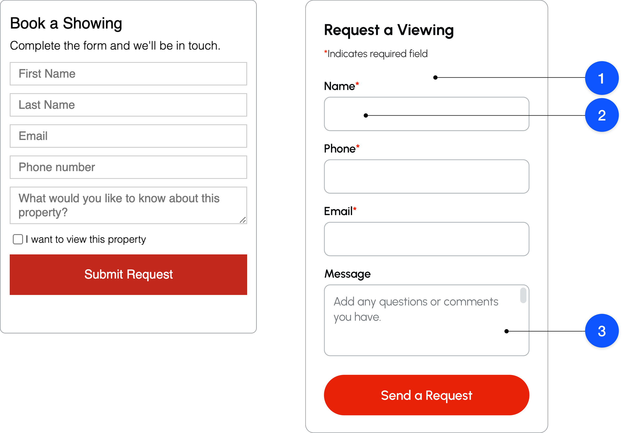
Example of redesigned text inputs
Identifying the perceived difference in BrandRed & StatusRed colors
HomeAds brand color is red. Color red is also intended to be used for error messages. While it’s never a good idea to redefine the semantic meanings of status colors (for example, red for errors), choosing colors that are visually too similar might confuse users. The solution is to define two different shades of red that have enough perceived color difference.
The most popular method to calculate the difference between colors is known as the CIE76 algorithm, where Delta-E is a single number representing the "distance" between two colors. Human eyes are able to quickly detect two shades of the same color if the “distance” falls between 30 and 40 (at the very least).
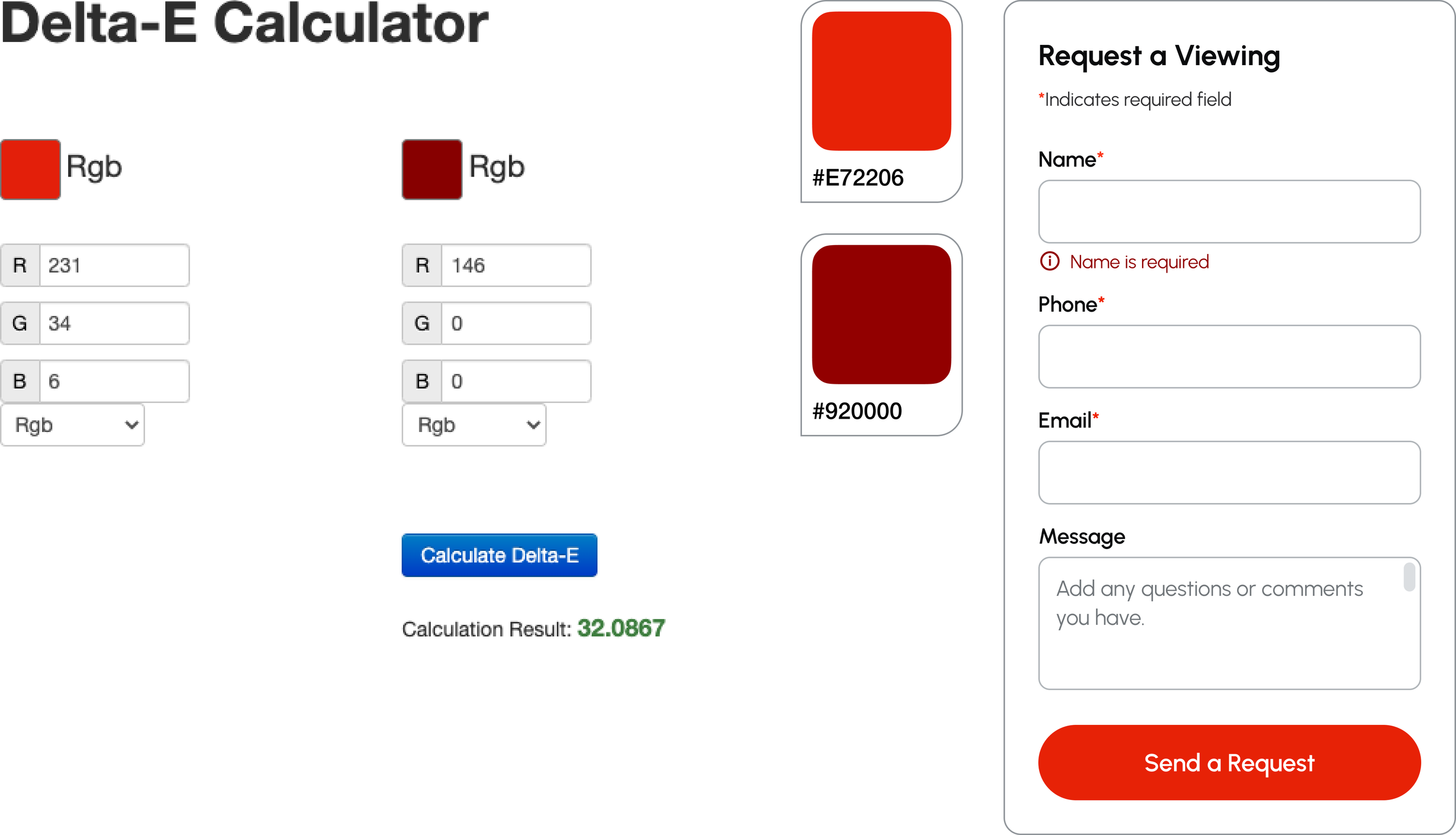
Delta-E calculation result for Chosen BrandRed and StatusRed colors is 32.087.
Improving touch (click) target sizes
Painfully small target sizes (touch and click points) are one of the issues I come across often in digital interfaces (especially those developed by non-North American designers). HomeAds was no exception. Considering that 46% of traffic comes from smartphones, this felt particularly concerning.
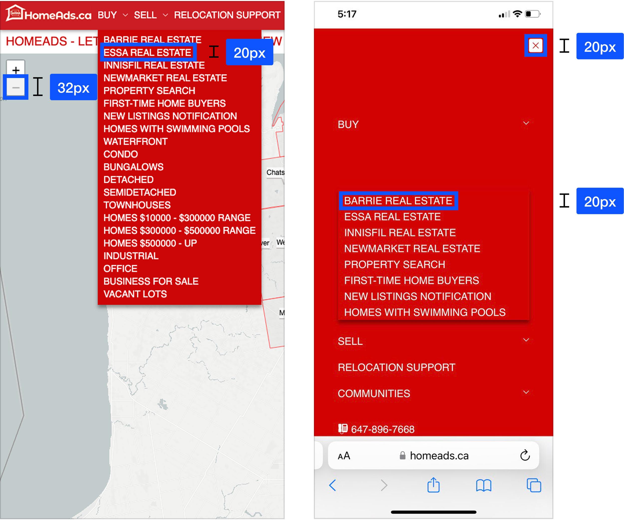
Examples of critically small touch targets in legacy UI.
Proper target sizes are essential not only for mobile and tablet UI, but also for a better desktop experience. Plus, modern laptops and tablets often support both mouse and touch.
I employed Apple’s touch target recommendation of a minimum 44 px to design most controls, including links and contextual menu items, reducing the risk of unintentional actions, especially for controls used frequently or or positioned where it will be difficult to reach (for example, near the edge of the screen).
This approach benefits a wide variety of users:
➣ Users who use a mobile device where touch screen is the primary mode of interaction
➣ Users who have low vision may better see the target
➣ Users with mobility impairments, such as hand tremors and those who find fine motor movements difficult
➣ Users who access a device using one hand
➣ Users with large fingers, or who are operating the device with only a part of their finger or knuckle
Bonus points for being able to reuse most of the same components for both mobile and desktop versions, keeping the design system scale at bay.
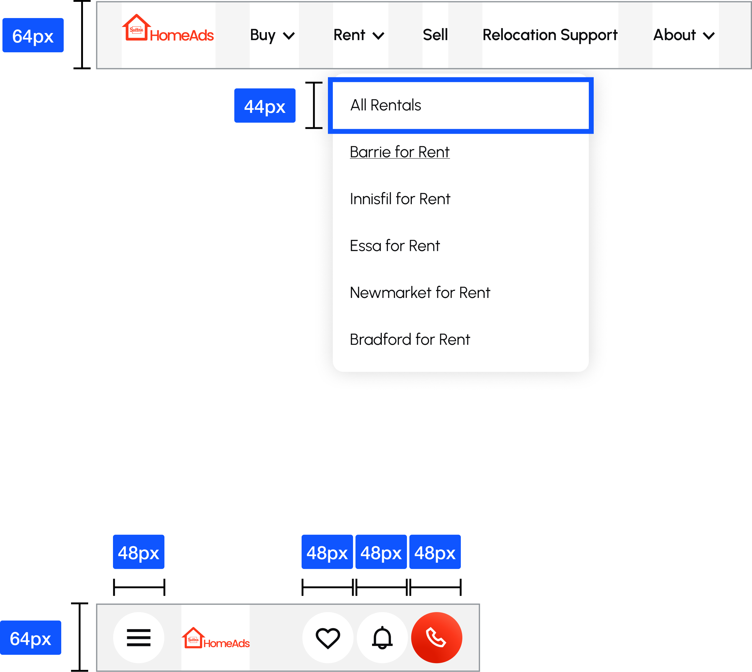
Target sizes applied to HomeAds redesign.
Redefining link design and microcopy
➣ 1. If links are not underlined by default, they should present a non-color indicator (e.g., an underline) on mouse hover. Not doing so violates one of the oldest and simplest rules of accessible technology: never use color as the only encoding mechanism.
➣ 2. As for the microcopy, it’s more descriptive than generic “Read more” or “Download now”. When links or buttons provide a bit more context about the page they lead to, everyone wins: everyone gets a more specific prompt to keep on reading, including people with screen readers.
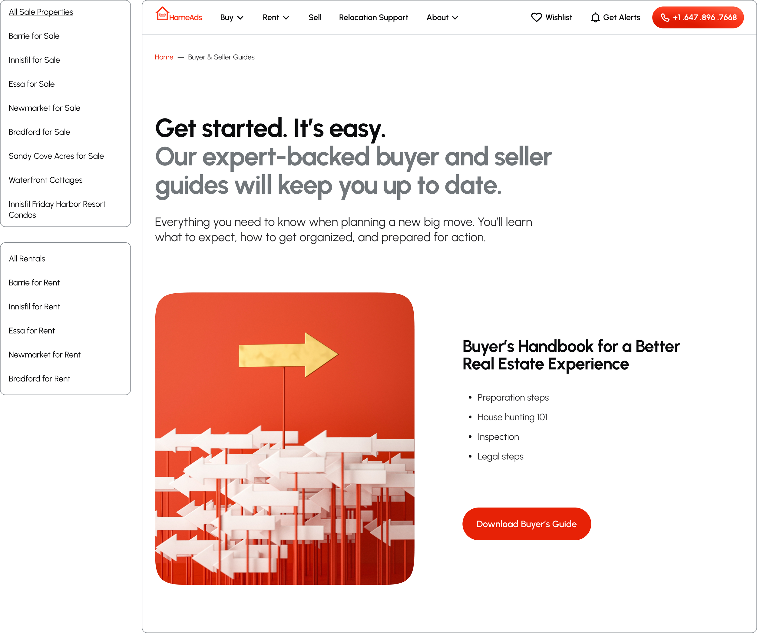
Examples of descriptive link microcopy.
Optimizing opt-in forms
All forms on HomeAds website looked overwhelming and required handling a lot of personal information, which made filling them out a commitment: users might experience insecurity or fear of getting spammed, or receiving too many promotional emails.
Furthermore, the form container itself was too wide. The more eye fixations and the longer the saccades, the more difficult the information on the page is to scan and perceive.
We collaborated with the client to get rid of all nonessential fields and keep only those that were absolutely necessary.
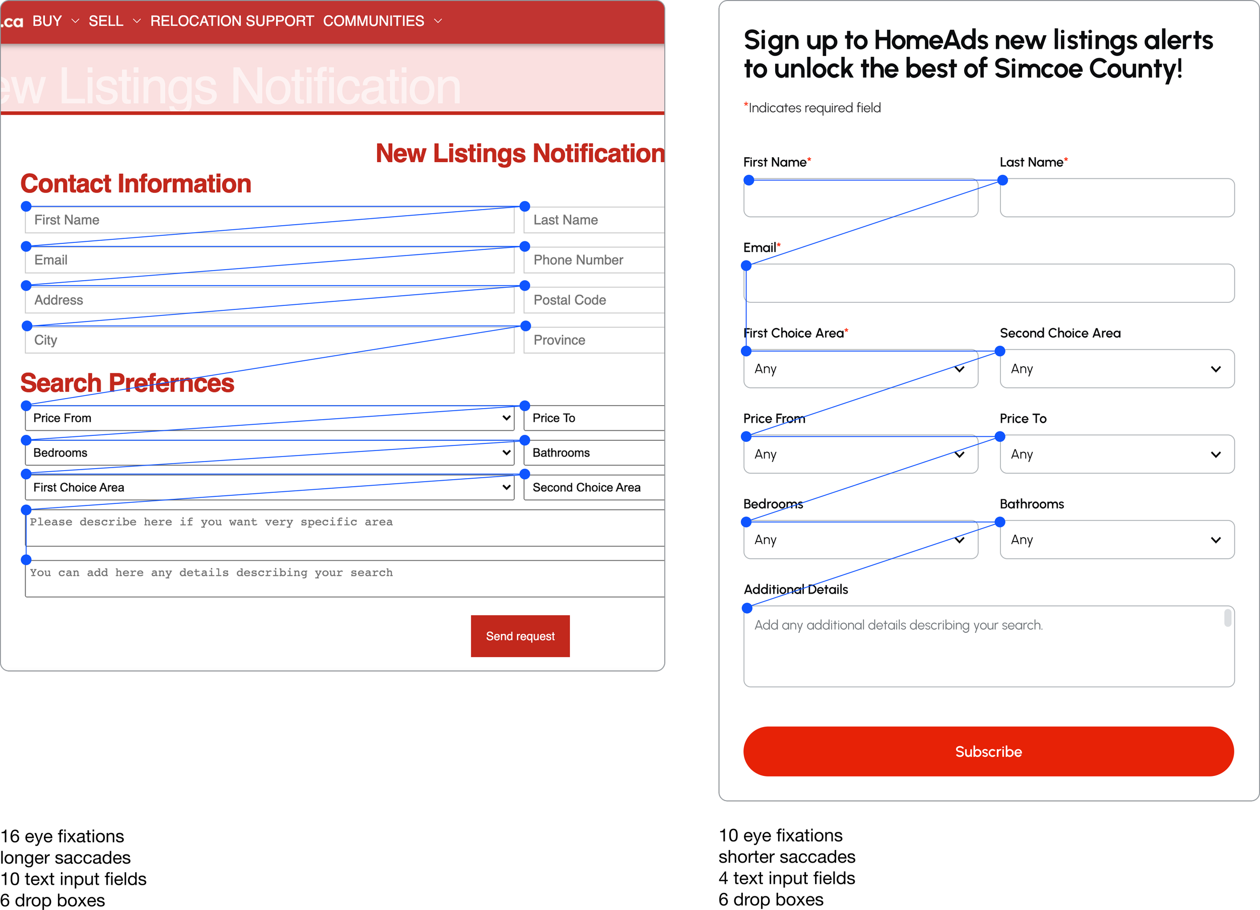
Example of a redesigned opt-in form.