
About Fitly
Fitly aims to help people who stopped exercising and tracking their health goals due to the pandemic get back to their workout grind. It allows users to set goals, complete daily guided workouts and challenges, log completed tasks to activity log and track their individual progress.
Overview
Fitly is my capstone project for a 12 week UX Design Diploma program at BrainStation. As a part of the curriculum, I was challenged to define a problem space and build a digital solution. I decided to focus on the problem space that would have some personal meaningful context, combined with an opportunity to help other people.
Before the pandemic started, I used to work out at the gym 3-5 times a week for the past 5 years, and it was an essential part of my life. I, however, failed to adapt my exercise routine to the new reality after my gym shut down due to the COVID-19 quarantine, and stopped working out altogether. Having said that, I intended to create an app that would help myself as well as other former gym-goers to meet exercise target during the lockdown.
Duration: 8 weeks
Purpose: Academic
Role: Product Designer (User Research, Sketching, Prototyping & Testing, Visual Design)
Deliverables: MVP
Tools: Pen, Paper, Sketch, InVision
Platform: iOS, iPhone 11 Pro
Problem Space
The COVID-19 lockdown has made people more sedentary, they exercise less than, and sit and stare at their screens more. People who were meeting exercise guidelines prior to the pandemic, experience reduction in their physical activity level since social distancing measures went into effect in March 2020.
Project Constraints
It’s currently unknown how the situation will unfold, and long-term consequences of the pandemic are unpredictable. Although social distancing and self-isolation measures will supposedly have to remain in place until 2022, life may return back to normal sooner. In this case the proposed solution may not be as in demand as I had anticipated by the time of the launch.
The fitness app market is saturated and oversaturated. Therefore, it is extremely difficult to engage and retain users.
The delivery time is quite rushed, I may not have enough time to deliver the desired quality.
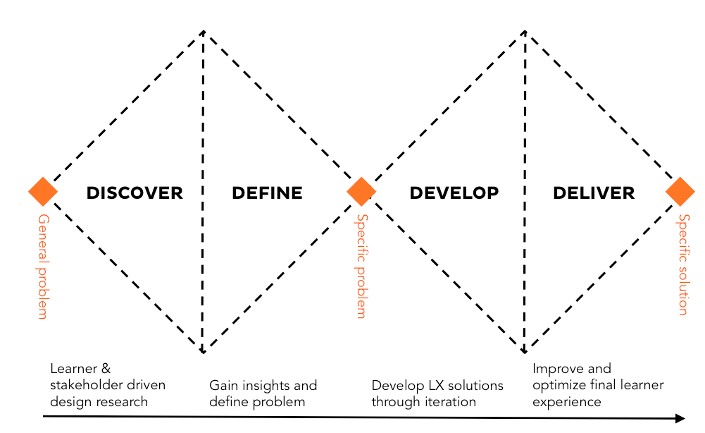
The Process
The Double Diamond design process model was used to tackle this challenge. The entire process was divided into four phases: research, synthesis, ideation and prototyping.
Discover
Secondary Research Key Findings
Secondary Research insights showed that I was not the only Canadian facing the challenge (as of June 2020). From various news articles, it became evident that many provinces experienced significant decline in average activity level:
42.20% of Canadians are hesitant to return to gyms, once training facilities reopen, even if it’s deemed safe. More than 15% of those Canadians have already cancelled their memberships, or are considering doing so.
49% of Canadians say that their exercise routine has been affected by the pandemic.
52% of Ontarians failed to adopt their exercise routine to the pandemic reality, this number is even higher in Alberta (54%), Quebec (56%) and British Columbia (61%).
Once the problem space has been validated by the data, the How Might We Question came naturally:
How might we encourage people to remain physically active, while practicing social distancing?
Primary Research
To develop a deeper understanding of my target audience, I prepared an interview script and recruited three former gym-goers to conduct interviews. My plan was to focus on having my interviewees describe their pre-pandemic and current behaviours. Questions were primarily open ended and varied from general (“When did you first start working out and why?”,”What keeps you motivated and consistent in achieving your fitness goals”) to more specific (“How often did you work out before the pandemic, and what’s your training schedule now?”, “What do you find the most challenging about managing your fitness and health routine at this time?”). They were followed by additional “whys”, depending on how the conversation went.
Methods and Tools: Zoom, Google Meet, Slack, Otter
Participant Criteria:
24-35 years of age
A gym member prior to the pandemic
Would work out 3-5 times/ week prior to the pandemic
Lives in the quarantined area
Challenged by staying motivated and consistent
2. Define
I sorted all relevant quotes from interviews based on behaviours, motivations and pain points.
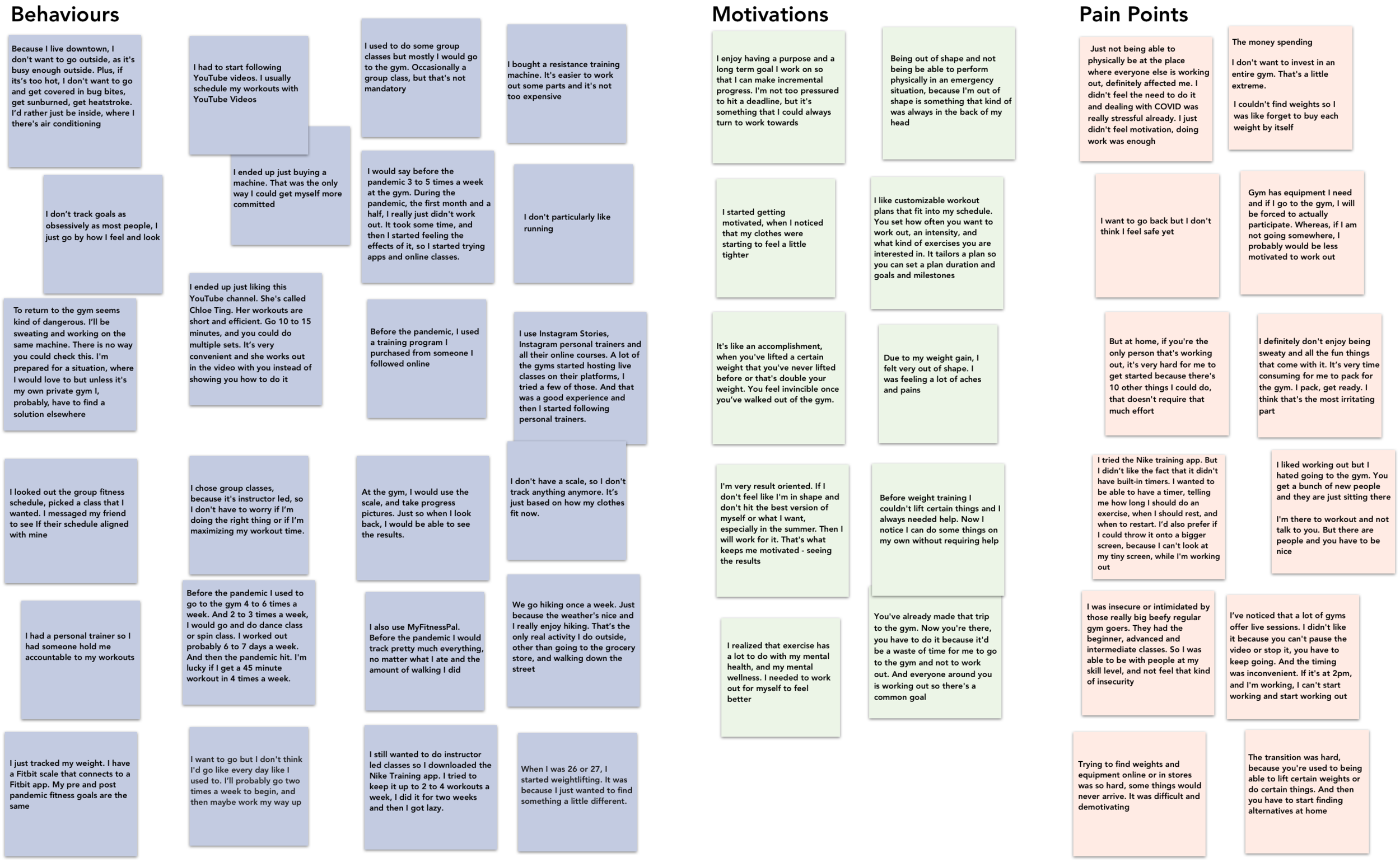
Interview Key Insights
Although the responses quite varied, I distilled the results of primary research into the following insights. They will play an important role in developing the features of my future app.
It’s challenging to build a workout routine without coaching and guidance
People set individual goals. While competition against others can push people to be their best, it can also be discouraging
Seeing results is the best motivation
It’s challenging to find fitness equipment online and in-store
“Short workout is far better than no work out at all”
Pandemic alone is already stressful. People do not feel the need of exercising
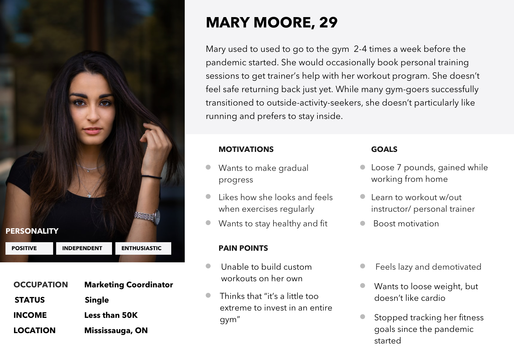
User Persona
For the purpose of building the digital solution that could effectively address pain points of my target audience and identifying opportunities for design intervention, I created primary and secondary user personas.
Meet Mary:
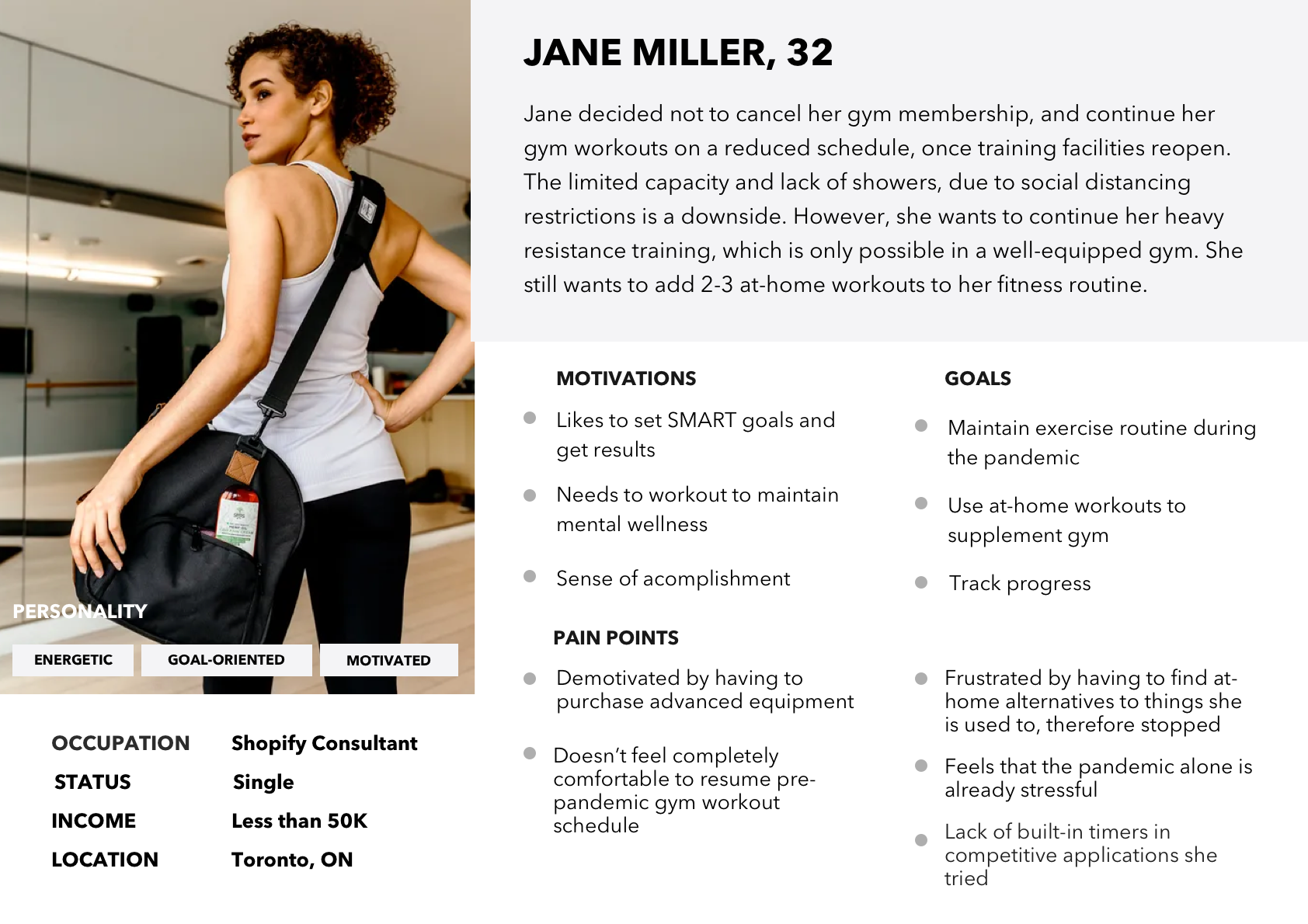
And Jane
Experience Map
Based on personas and insights from research, an experience map was created to gain a better understanding what users are feeling, thinking and doing, and to assess areas of opportunity.
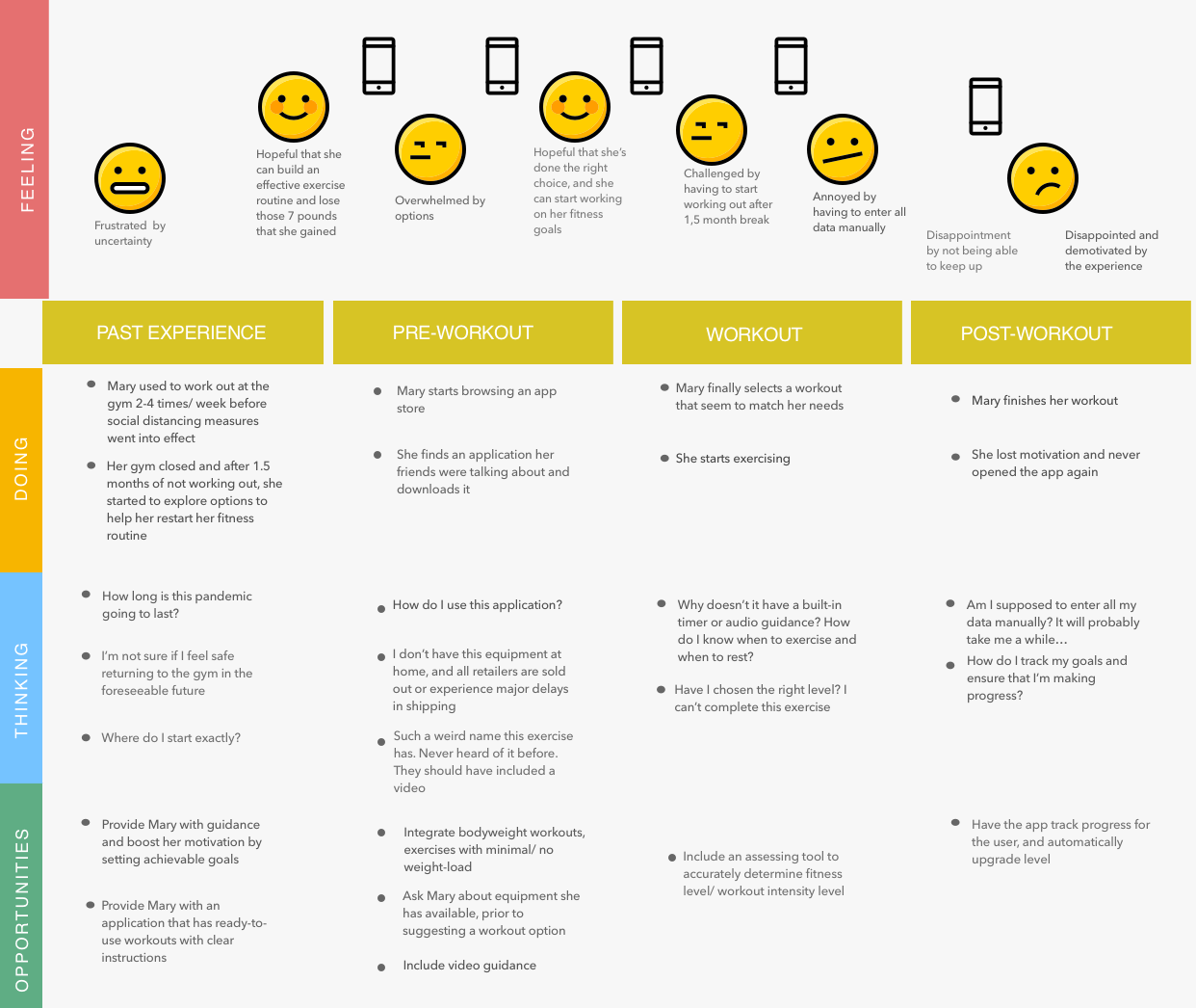
Experience map: Mary’s past experience, pre-workout, workout and post-workout journey
While most pain points were realistic and approachable, low motivation seemed to be the most difficult to tackle. I set out to get to the root of it and spent the next couple days researching, which led to some interesting findings.
The problem turned out to be as old as time: Aristotle, David D. Burns, Kurt Lewin and a number of modern psychologists and coaches dedicated years of work attempting to grasp the nature of motivation. Below is the summary of my discoveries:
Success reinforces motivation. In other words, the more successful a person at something, the more motivated they become to continue doing it.
Goals have to be attainable and allow gradual progress. In this case, accomplished goals boost confidence and give the feeling of success, which once again will reinforce motivation.
The willpower is limited. When doing “musts” and “have tos” for long periods of time relying on willpower alone, its resource will soon drain. A person will start procrastinating and then inevitably quit. To put it simply, will lose motivation. There always has be the right balance of spontaneous desire and the willpower. Therefore, when the motivation is low, it’s much easier to convince yourself to do something for 5 minutes, rather than 30 minutes. It reminded me of one of my interview insights “Short workout is far better than no workout at all”.
Summarized Areas of Opportunity Translated Into Product Features
1. Guided workouts
2. Attainable goals and flexible workout duration. A fifteen-minute workout will still count, and will be treated as an achievement
3. Activity log to track individual progress and see results over time
4. Built-in timer displaying both time elapsed and the countdown
5. Option to select available equipment
6. Visualization and interactivity. Video guidance.
3. Develop
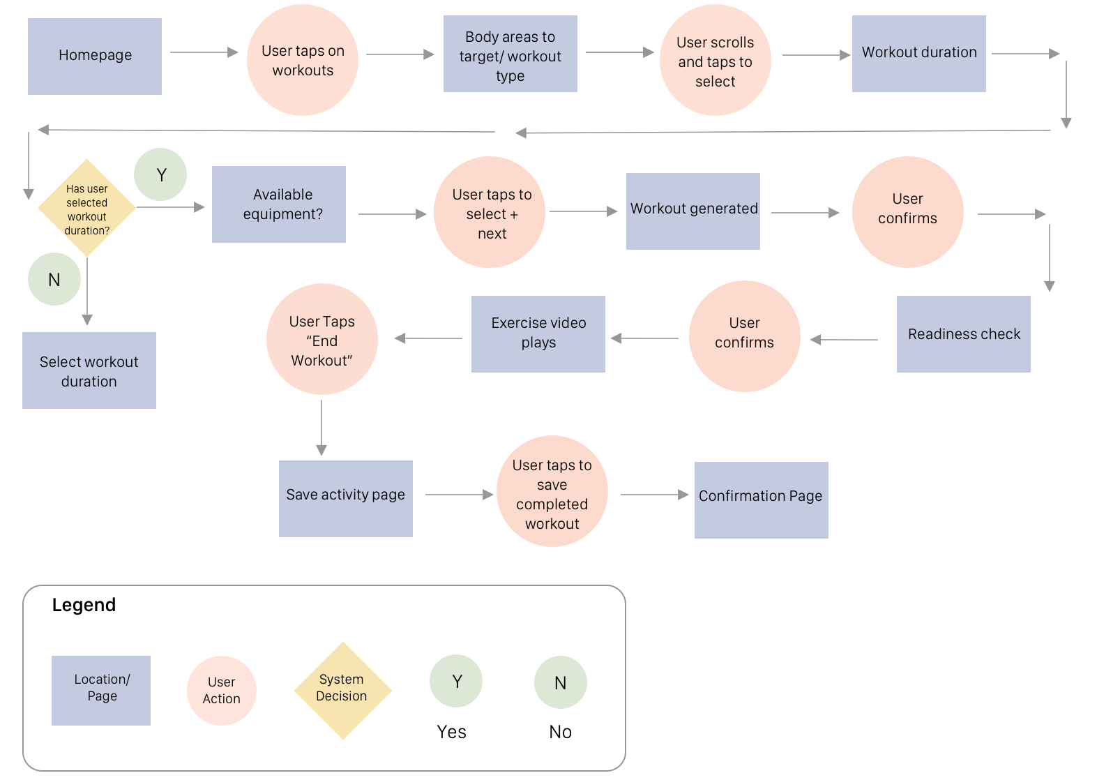
Task Flow
I crafted around 25 user stories with standout epics being workouts and progress tracking.
I decided to focus on the task flow of how the user completes the daily guided workout and then logs this activity to activity log.
Paper Sketches
After taking into consideration research key findings, persona pain points, goals, motivations, experience map and user stories, I began sketching out variations of screens for the selected task flow.
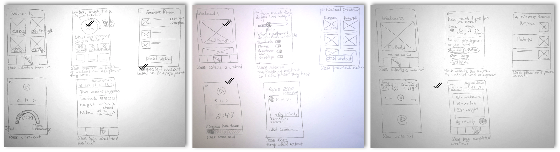
I then translated my sketches into medium fidelity wireframes.
4. Deliver
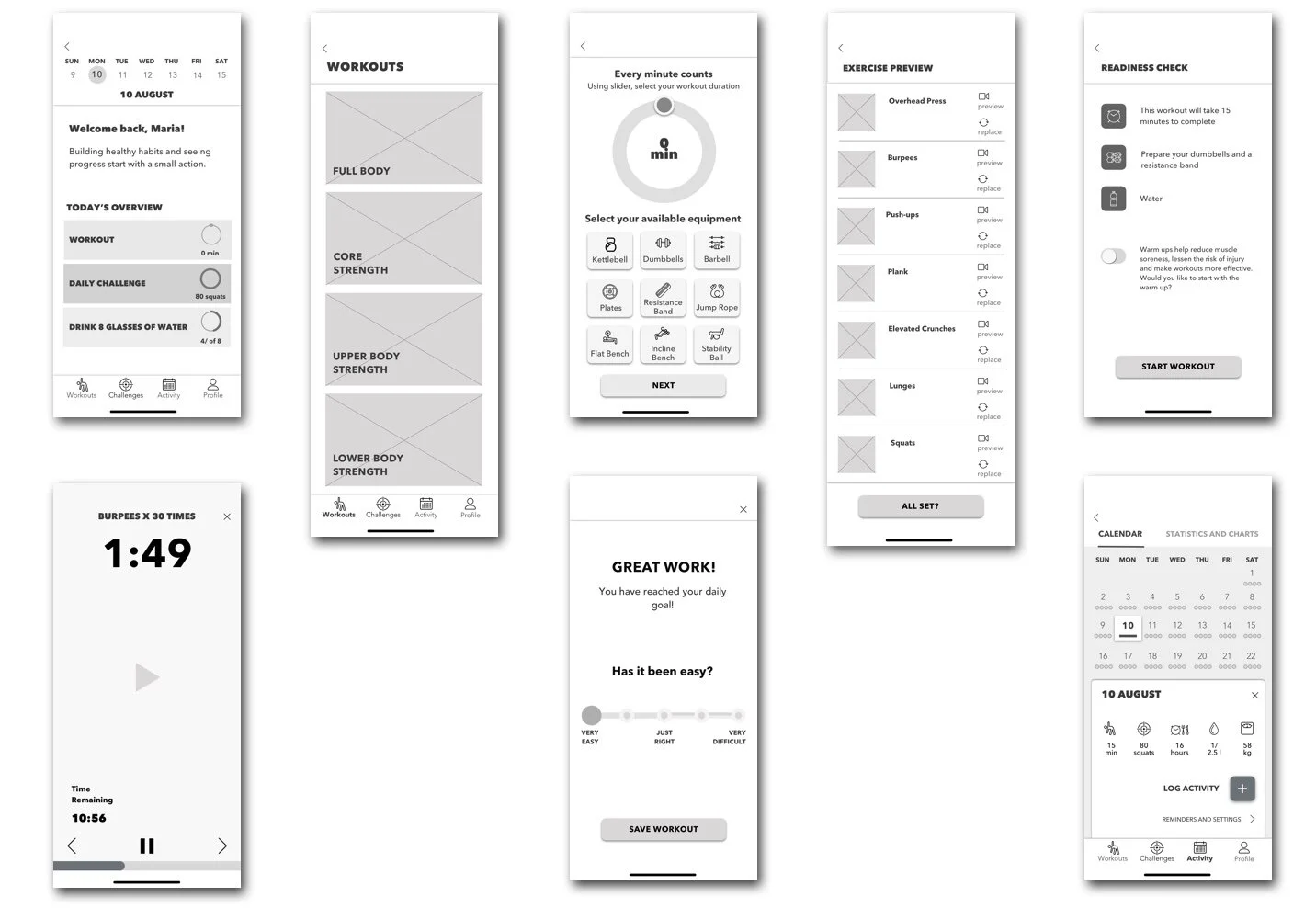
Initial Wireframes
Usability Testing
Two rounds of usability tests were conducted. I asked participants to try the app to assess if it worked as intended. I developed a scenario, a test script and conducted 9 tests to evaluate the completion of 5 tasks. I tested with users who matched my interview participant criteria.
The tasks were quite straightforward and aimed to test navigation from the home screen, interactive features and the clarity of an overall flow, from selecting a workout to logging it to activity log. User feedback was implemented to improve features, structure and design of the product.
Methods and Tools: In-person Interviews, Google Meet, Zoom
Below is the summary of the major user pain points that were discovered and addressed during usability test sessions, as well as screen by screen comparison between V1, V2 and V2 iterations.
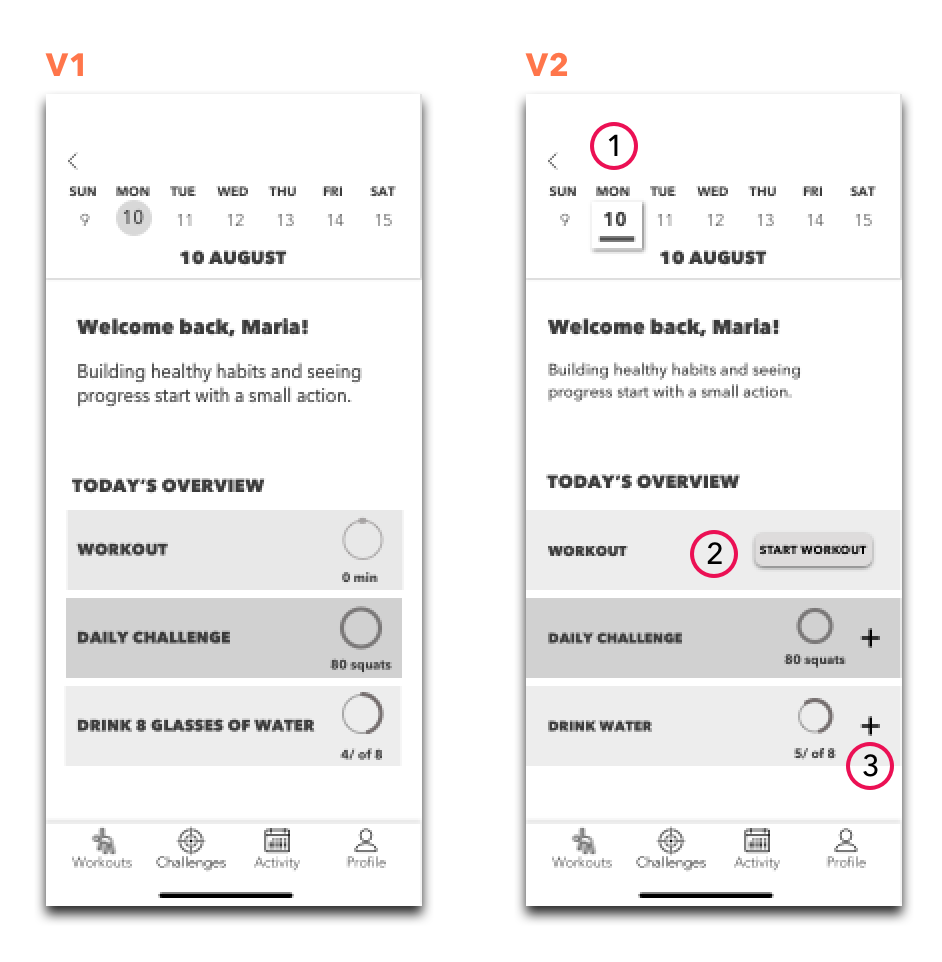
1) Redesigned home screen in Version 2 and added interactivity to quickly access today’s goals and add data if needed
2) Although the “Workouts” button of the bottom navigation bar was easy to find, and users were able to complete this task quickly, they would prefer to access workouts directly from the home screen and were a little confused by having to navigate to the bottom bar to find workouts.
CTA button was implemented to the home screen for uncompleted goals (workouts and challenges).
3) Revamped calendar to maintain consistency across screens.
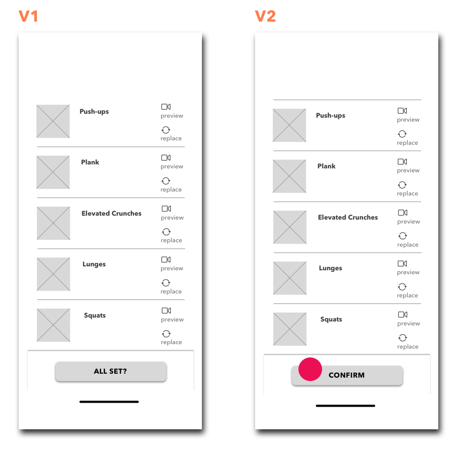
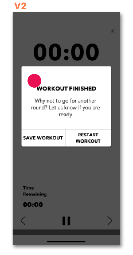
Wording “All set?” for the CTA button was the source of confusion not only because of the question mark, but also because users were under impression they were about to start working out, and did not expect the readiness check screen to appear next.
Verbiage edited to “Confirm” to remove ambiguity.
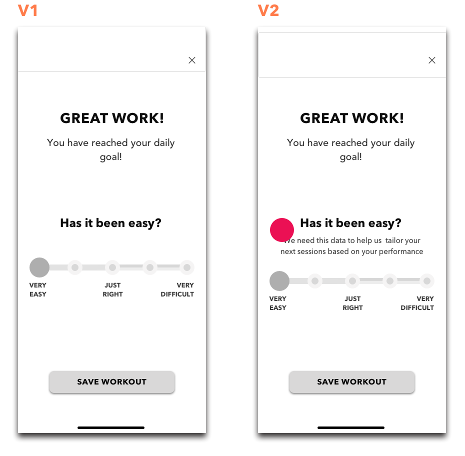
Users were unclear why they were asked for the feedback post-workout.
I added copy to Version 2 to indicate why user feedback was requested.
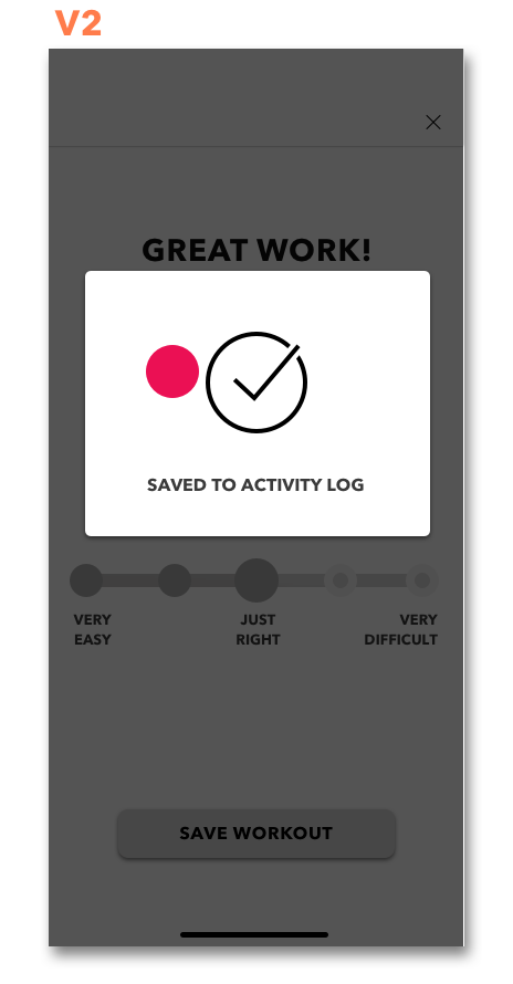
When I created the “Save Workout ” CTA button I assumed it’d be self-explanatory that completed activity would be automatically logged. In reality, it was confusing for most users, and required clarification.
A pop-up module was designed to keep users informed about the status of their completed workout.
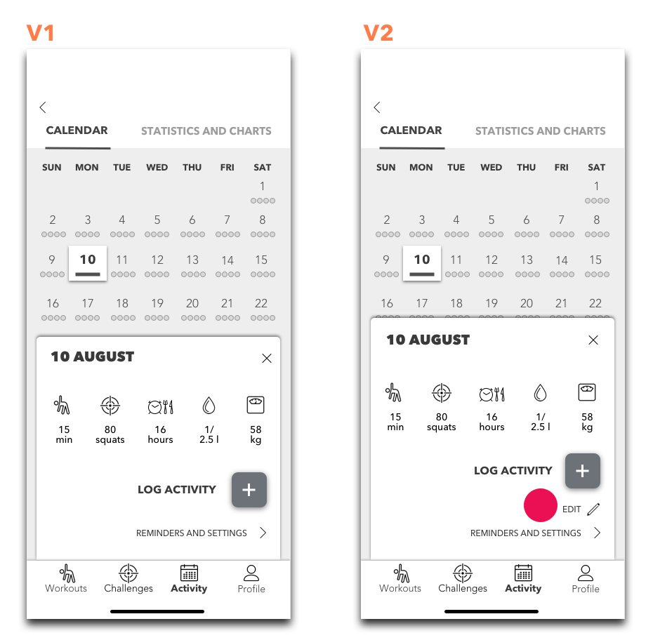
Users appreciate having the flexibility of editing activity. It would also help recover from errors.
An option to edit activity was added.
Workout completion was not obvious to users. A module was added to Version 2 to indicate status.
What worked, what didn’t and key takeaways
Users appreciated seeing labels on icons of the bottom navigation bar.
“Workouts” button in the bottom navigation bar was easy to find, and all users were able to complete this task quickly.
Users enjoyed interactivity and an overall UI of the prototype.
Users liked the “Readiness Check” screen and the fact that warm ups were optional.
Two testers appreciated “Workout Preview” feature, and one of them noted that they wish the app they were using had it.
Upon completion of my user testing sessions I realized that copy was significantly important. I was so focused on interactive features, that forgot to add annotations. All sliders and buttons were intuitive and most user ambiguity was associated with the copy. What I thought was self-explanatory was not immediately obvious to users.
Visual Identity
Moodboard
I started with compiling a list of adjectives embodied by the brand followed by an A more than B list:
We are more actions than words
We are more active than Inert
We are more inspiring than dull
We are more motivational than preachy
We are more engaging than forcing
We are more encouraging than controlling
We are more focused than dreamy
We are more powerful than weak
We are more enthusiastic than indifferent
It helped me to identify four descriptive keywords relevant to the brand. Although I was iterating on the fitness app, I tried to avoid being too straight forward when searching for visuals, and focused primarily on emotions and feelings the app should evoke. The four keywords I selected were: interactive, moving, dynamic, fresh.
Click for InVision Moodboard and UI inspiration board
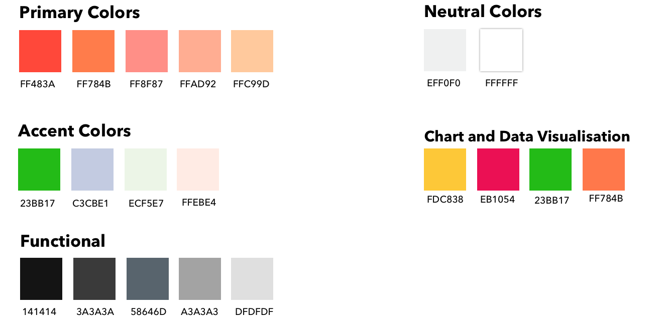
I used Sketch Color Picker to extract a color palette from the moodboard. I played around the colors in Adobe Color Wheel, and used WCAG contrast checker to ensure that those distilled colors comply with WCAG 2.0 standards. Some colors were darkened/ lightened to ensure proper contrast ratio.
After the decision about the final color palette has been made, I moved on to branding.
Branding
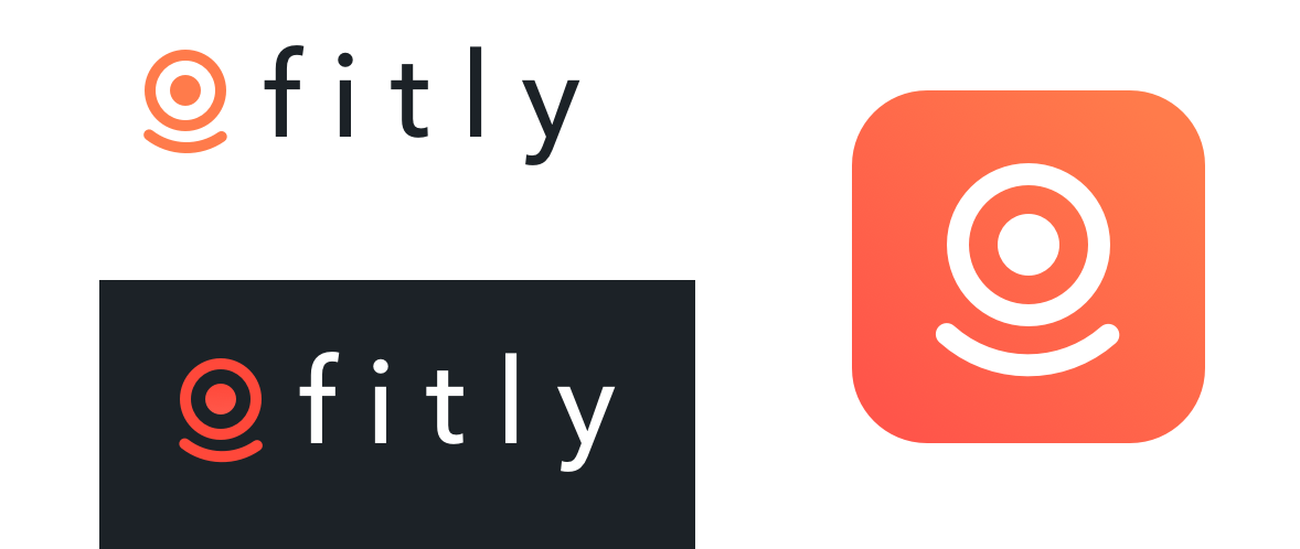
While working on logo sketches, I unchecked capitalized letters from my list. Lowercase letters seem more approachable and allow users to feel more connected to the brand. Lower case is also less traditional and associated with interactivity and playfulness.
Since the app is aimed at helping users to achieve their health goals, the symbol goal achievement is associated with is target. Sense of accomplishment motivates my persona to work out and increases her emotional well-being. Keeping in mind “what we are not”, I started exploring the idea of “fit for happiness” and experimenting with “targets” and “smiles” for the brand logo.
Final Logo and App Store Icon
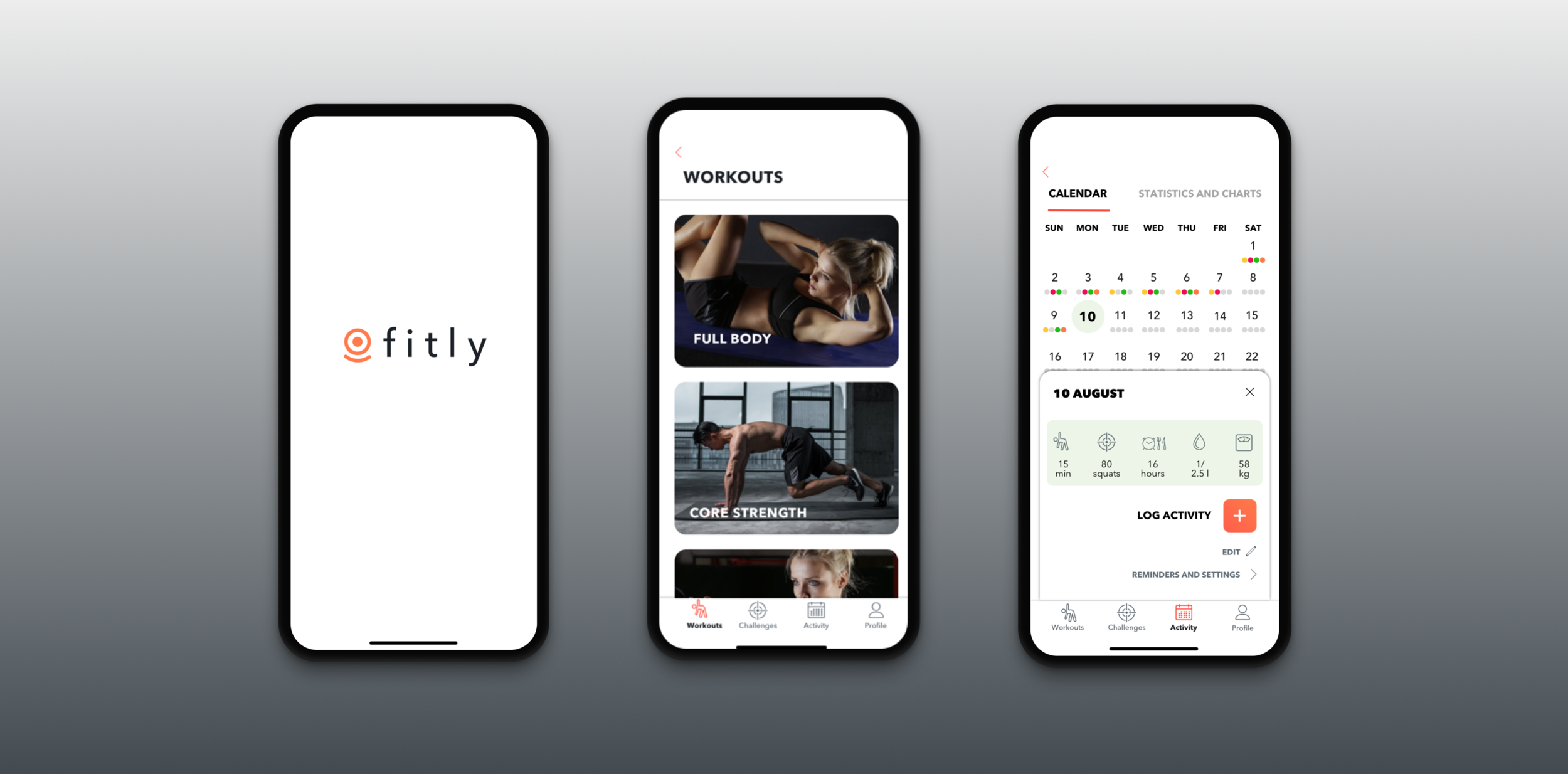
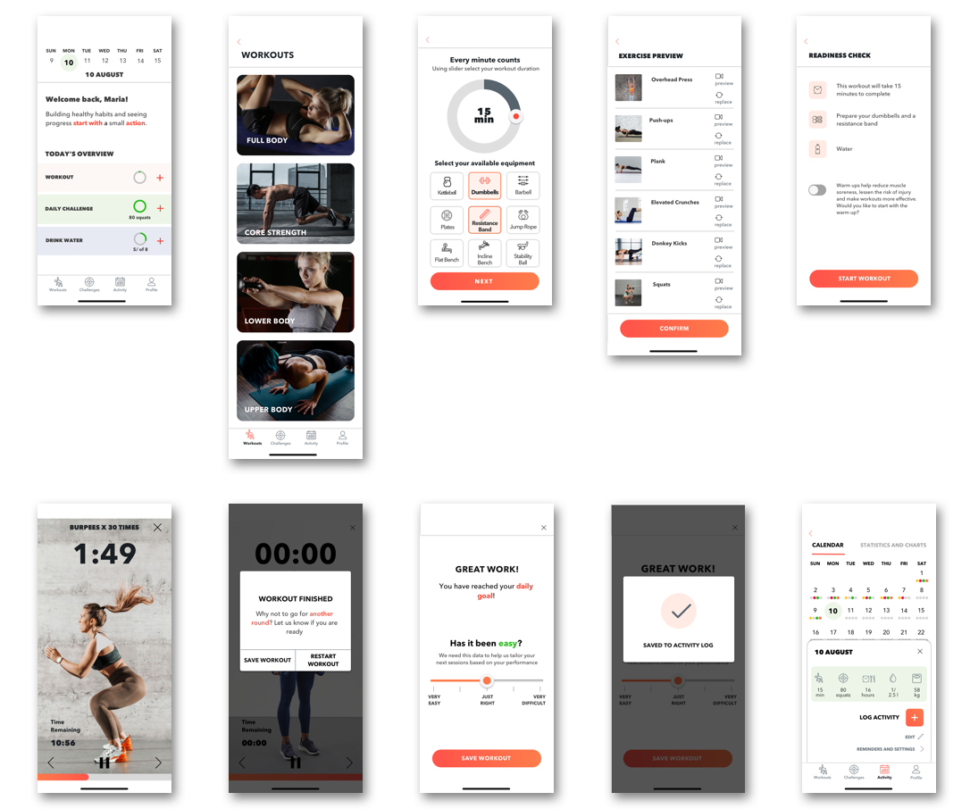
High Fidelity Wireframes
Click here to view InVision prototype
Marketing Website
As a part of responsive design, I was tasked to create web and mobile versions of the marketing website for Fitly. The website is focused on highlighting product features and what potential users could achieve if they start using the app.
Web Prototype: Click here
Mobile Prototype: Click here
Multiplatform Challenge
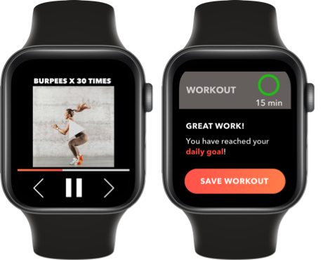
When asked to convert my design to an alternative platform, Apple Watch was an obvious choice for the fitness app. It will allow users to complete selected workouts, track daily progress and save activity just like in the mobile version.
Future Thinking
8 weeks is a limited time to design a complex fitness app. If given more time, I would rework some of the high-fidelity screens in the flow I already built. I would also implement, design and test the daily challenge feature.
Tarot Cards of Tech
I also turned to tarot cards of tech to promote future thinking.
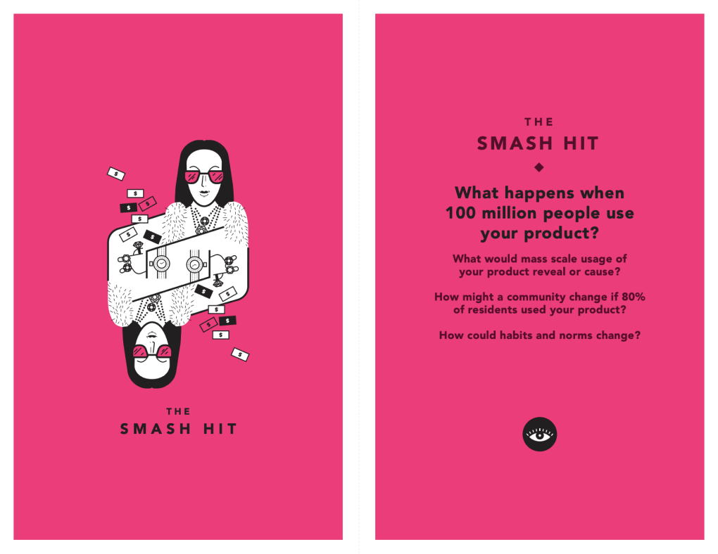
According to WHO, physical activity deficiency is one of the major risk factors for global mortality and a leading cause of chronic diseases. Promotion of exercise, even at moderate levels such as walking and cycling can have significant impact on the population health status.
Being fit and healthy has gained prominence over the last decade already, I dare to say that it became a trend. If 80% of residents used Fitly, it would help to convert a trend to a lifestyle. Having said that, growing awareness of the importance of leading a disease-free lifestyle and building better habits could change the situation on societal level.
Key Learnings
Don’t get emotionally attached to designs and ideas. Design belongs to users and will go through as many iterations as it takes to bring the desired outcome.
Stay truly open-minded and embrace ambiguity. Keeping a poker face and leaving behind my personal opinions, while concurrently trying to get to the root of the problem, was especially difficult during primary research (interviews)
While writing strong, condensed and convincing copy is a significant challenge, at times it was even more challenging to find ways to visually represent data. An idea of building the fitness app as the first project was quite ambitious to say the least.
When it comes to UI elements, oftentimes there is no need to reinvent the wheel. Staying consistent, keeping it simple, intuitive and utilizing best practices and standards is a proven winning strategy.
Colors have to be used sparingly and meaningfully. They also convey certain emotions, and can be explored from scientific and artistic perspectives. I found myself particularly interested in color theory and it’s application in UI design.